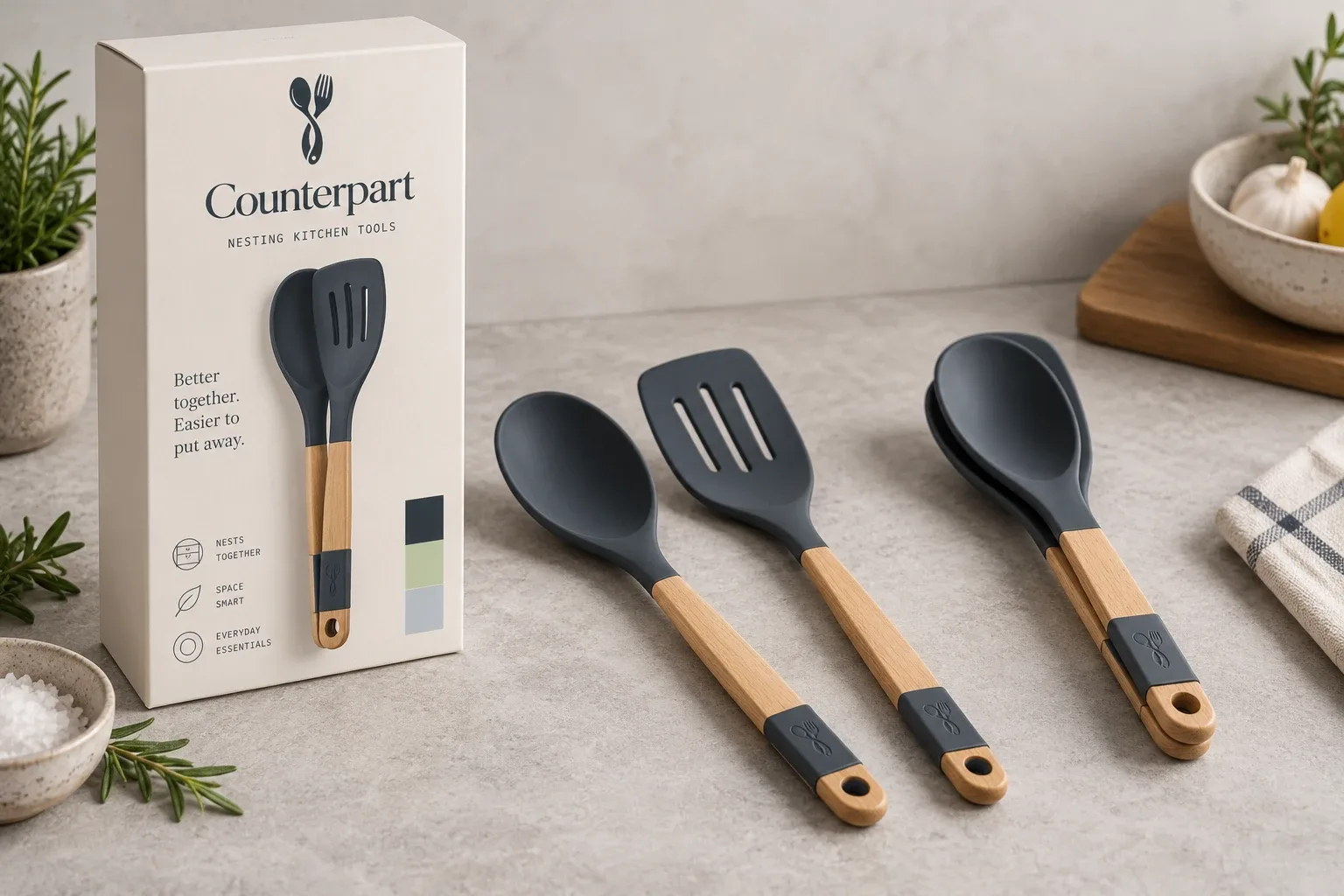
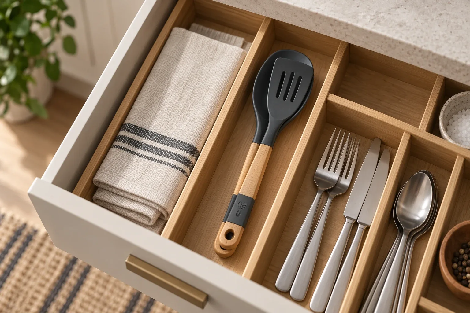
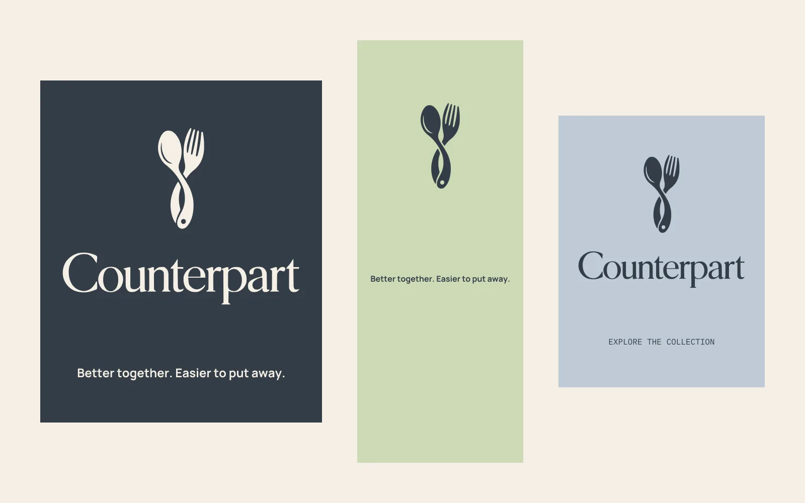
Better together. Easier to put away.
Counterpart is a kitchen-tool concept built around useful pairs that store together. I wanted it to suit a small kitchen without feeling like a compromise.
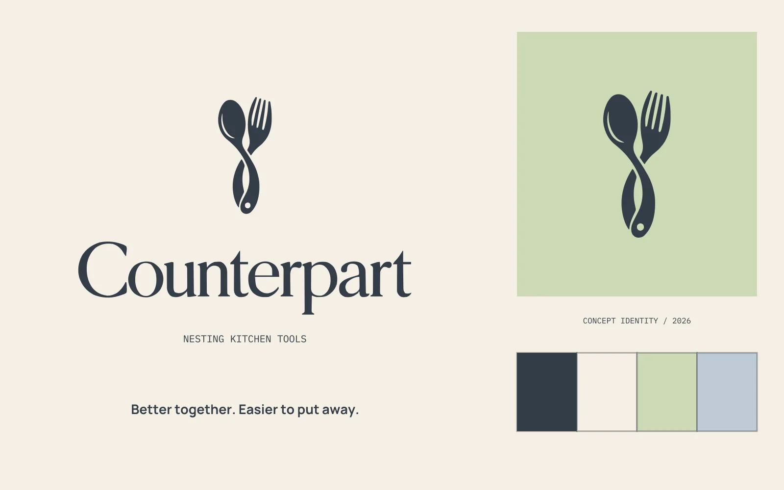
Self-initiated concept · Brand identity / Packaging / Art direction
The idea in the mark.
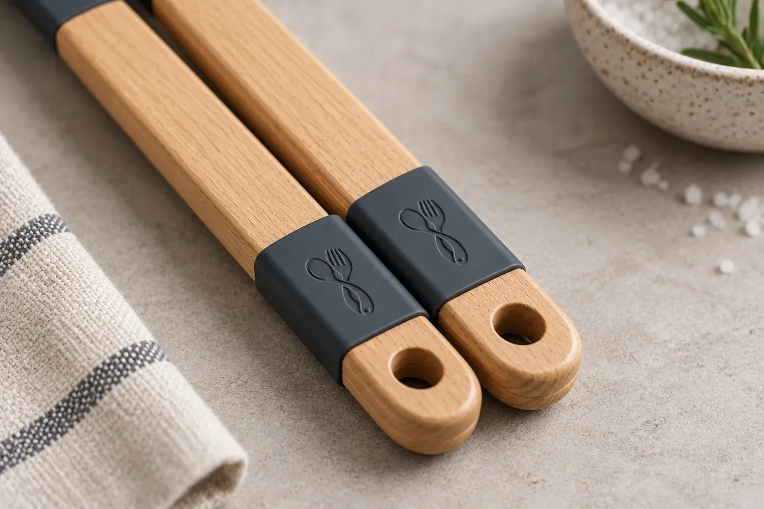
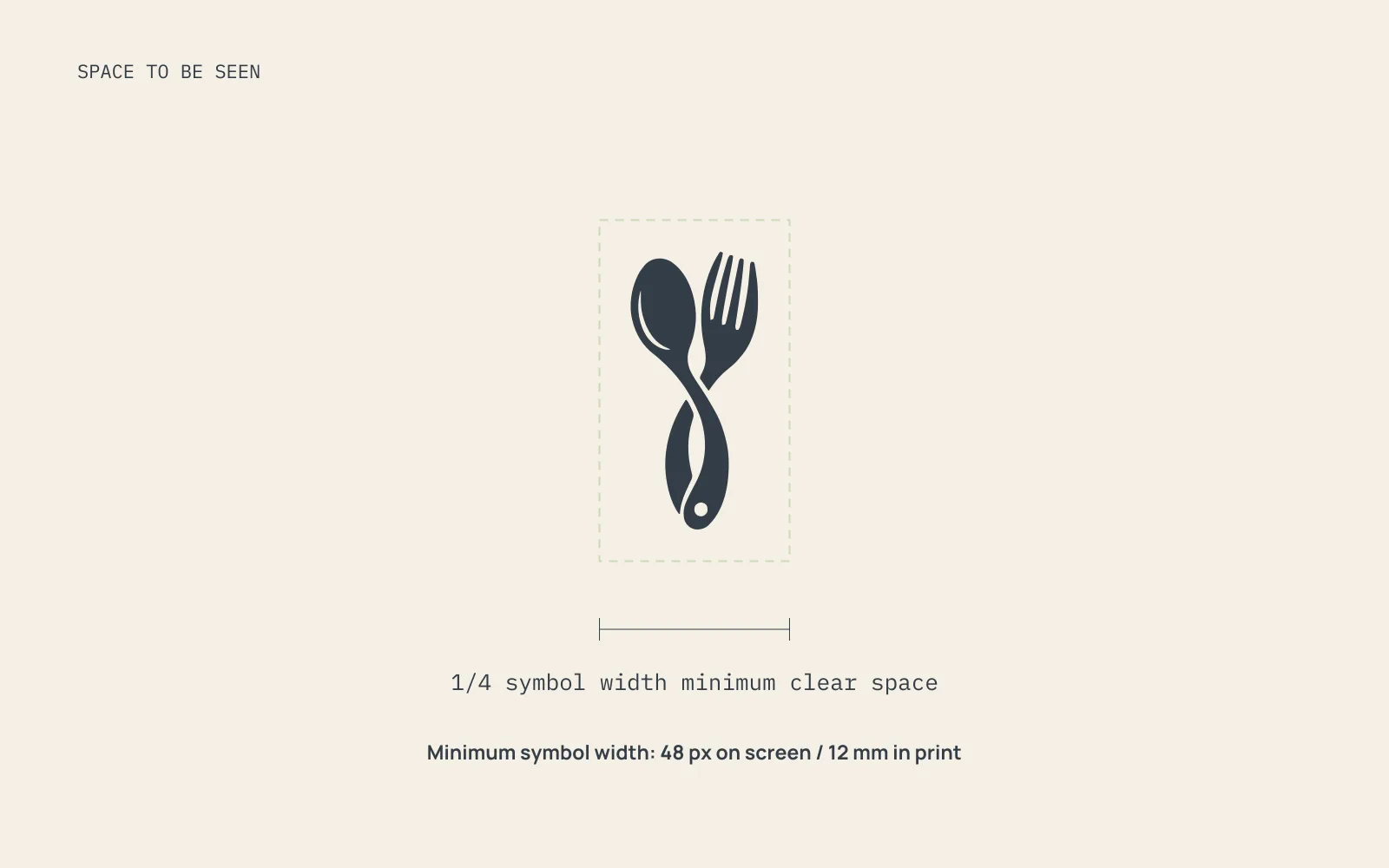
I joined a spoon and fork through their handles. The shared shape makes the idea of a pair clear.
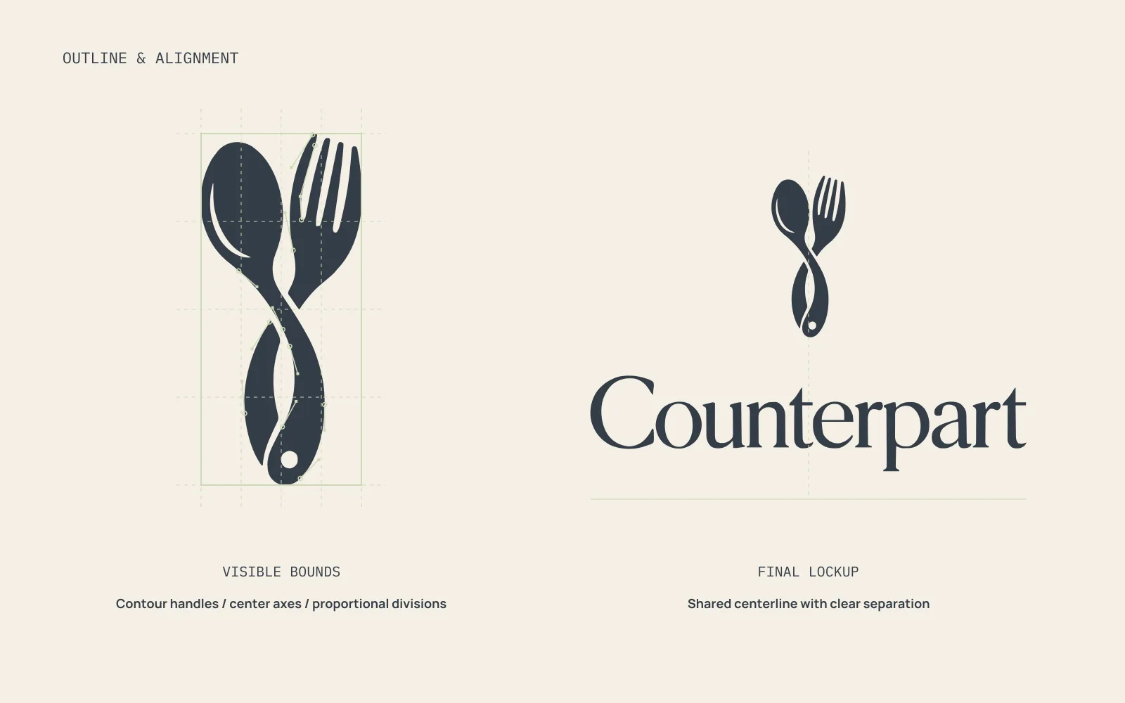
I used the final outline to check the curves, spacing, and alignment. Each version uses the same mark and lettering.
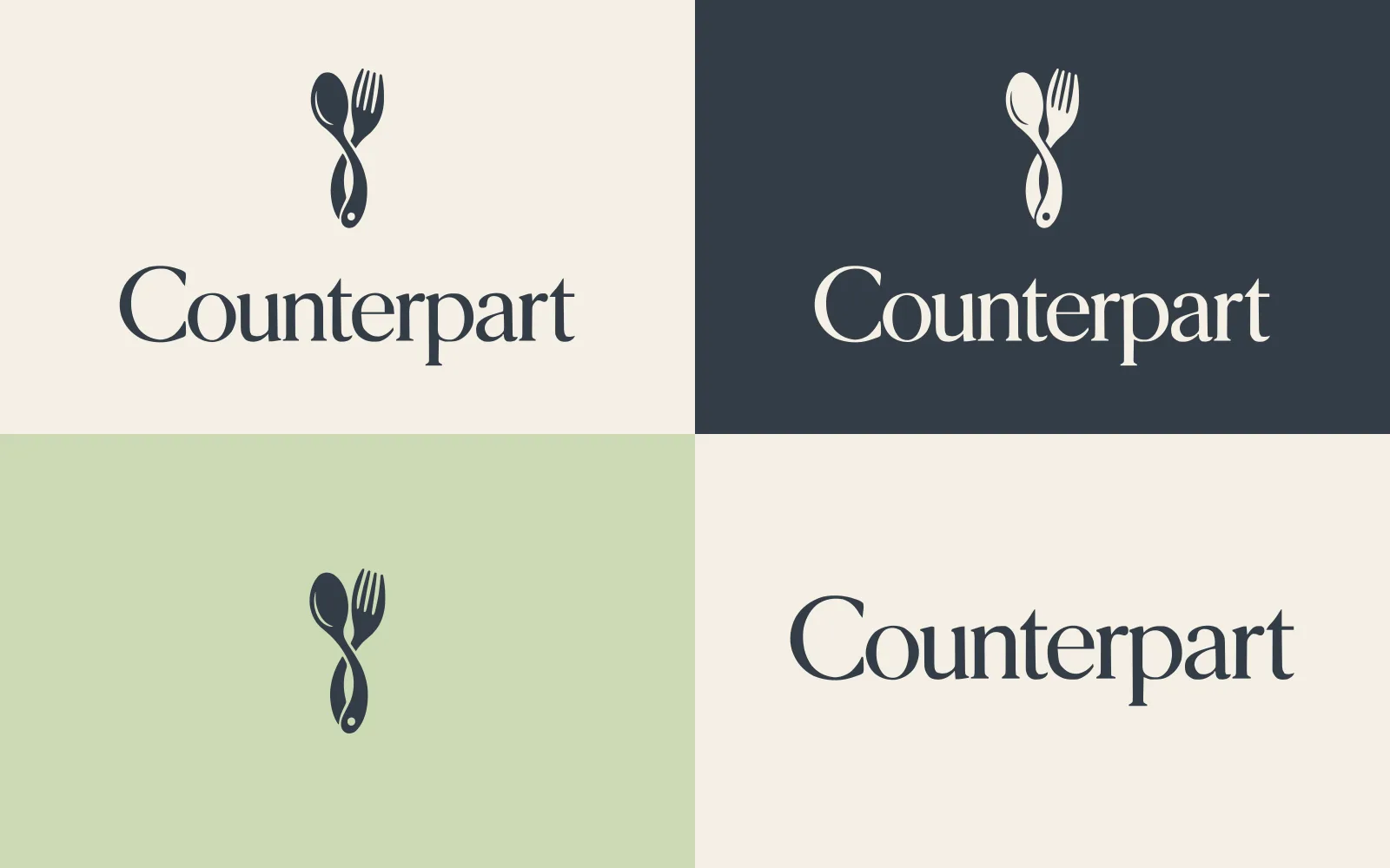

Colors that fit the idea.
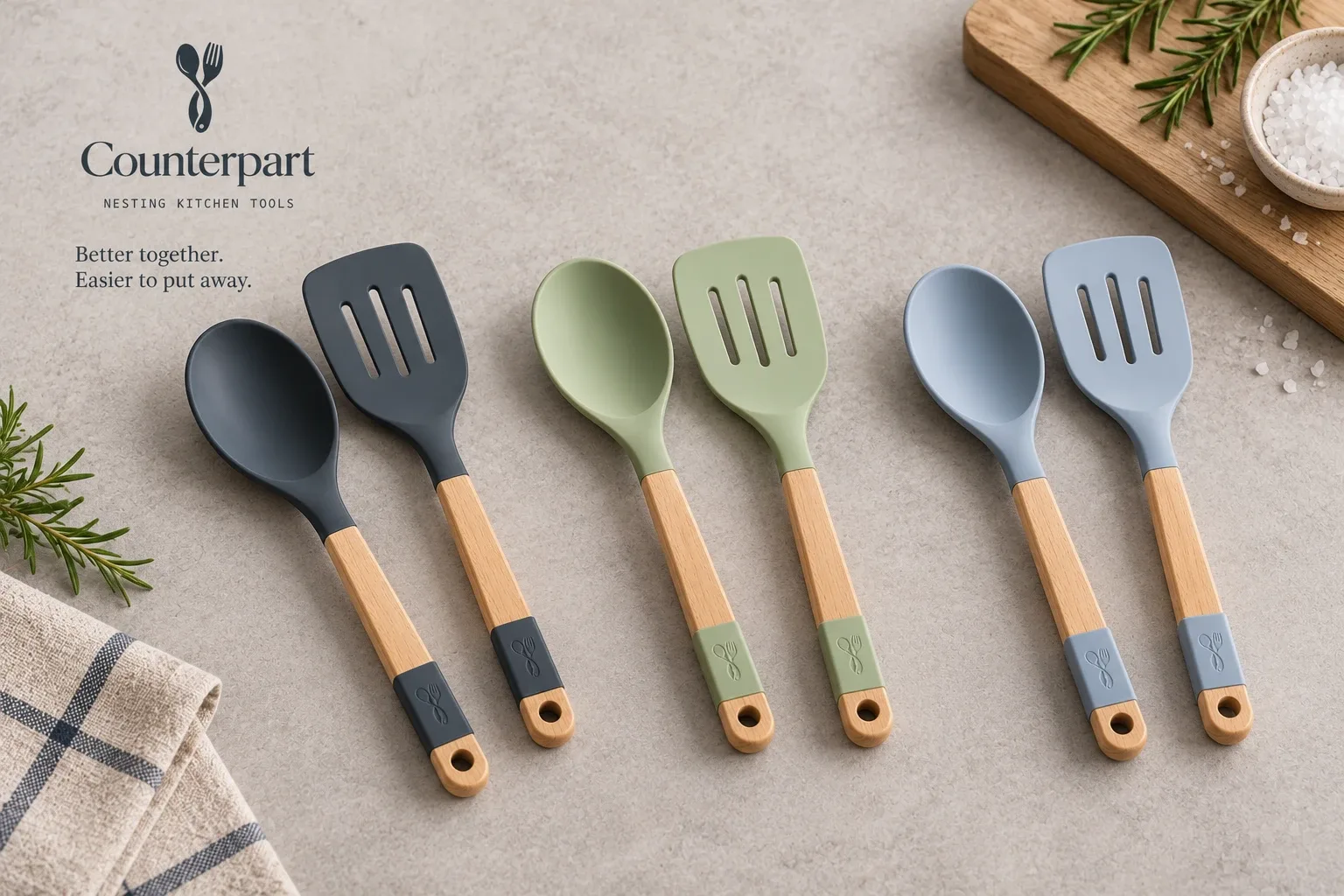
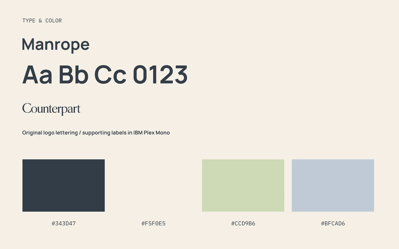
Slate and porcelain feel clean and useful in a kitchen. Pistachio and cool steel bring a quieter kind of color.
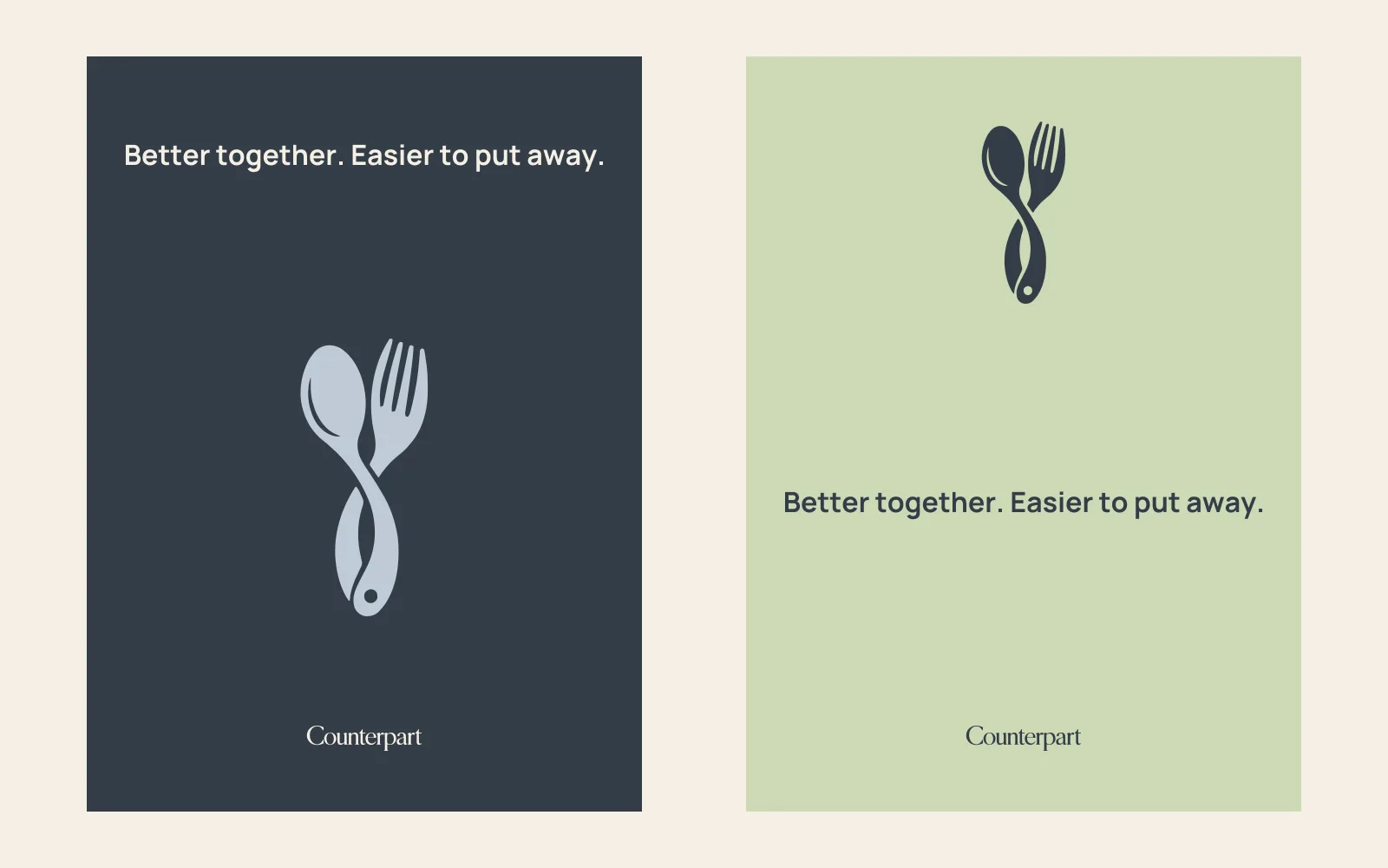
Another way to use the colors.
The same logo, using the brand palette.
The brand in use.
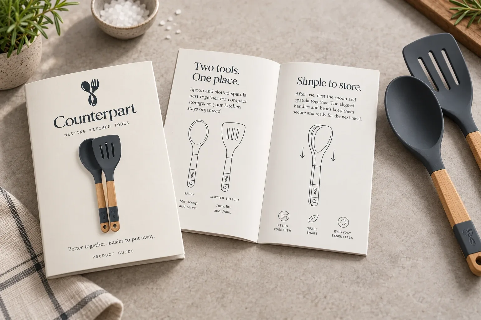
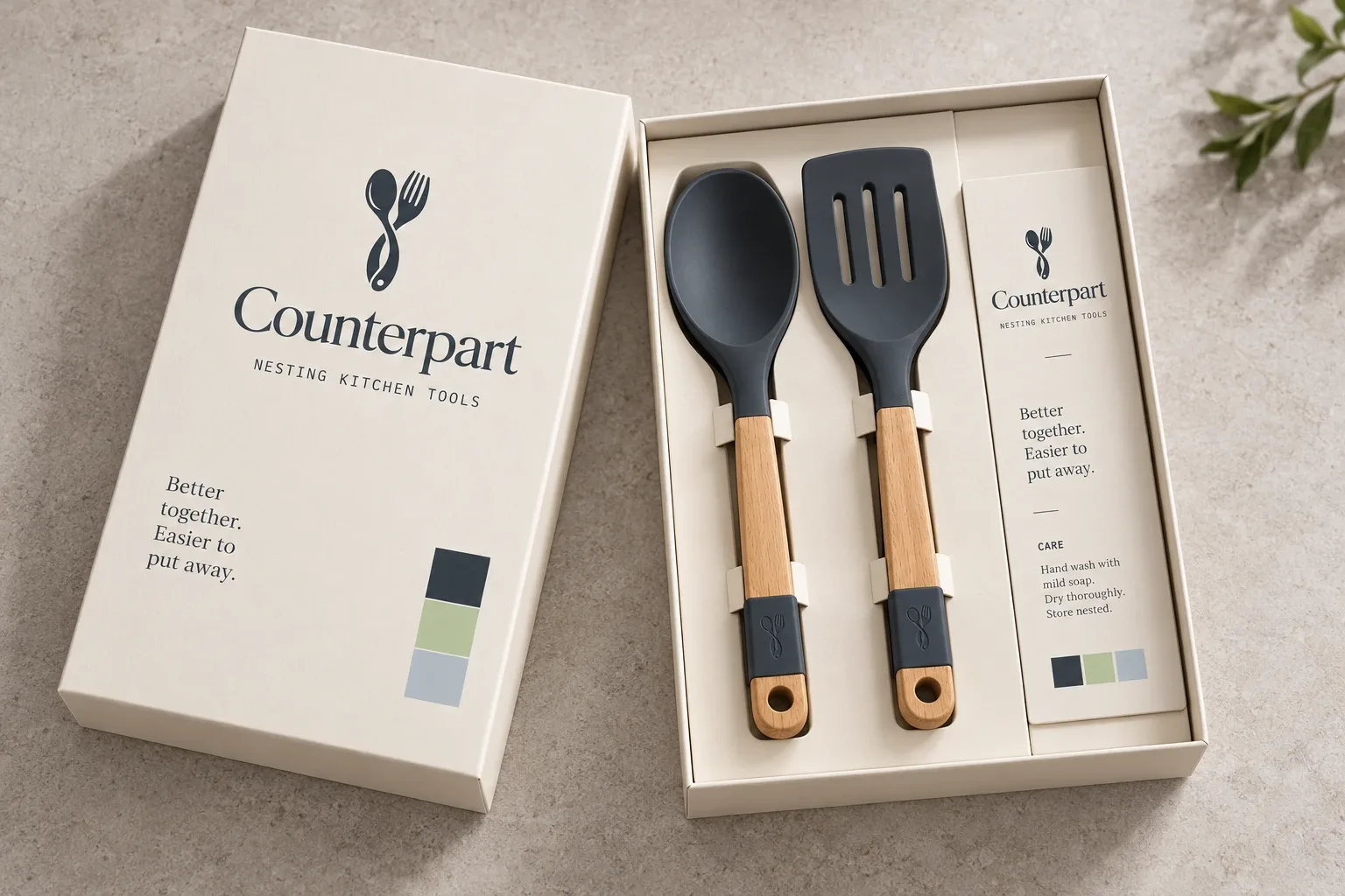
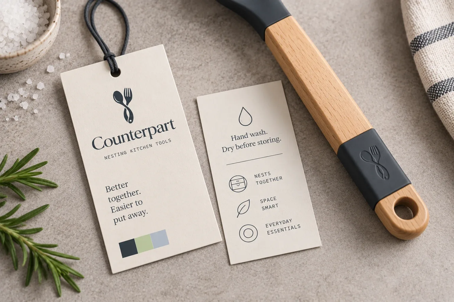
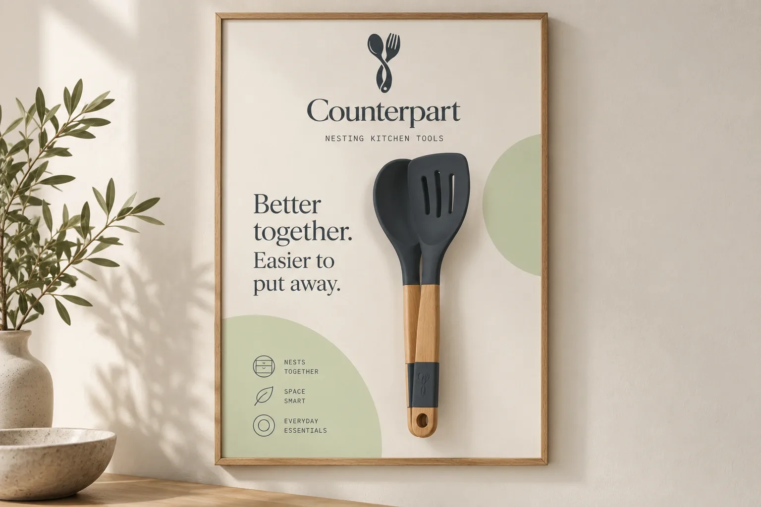
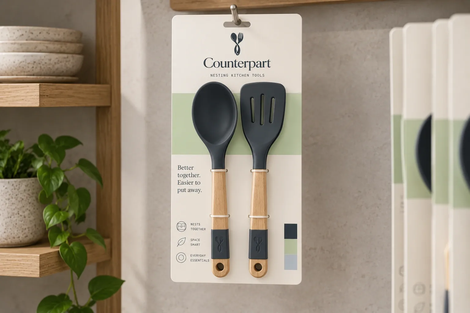
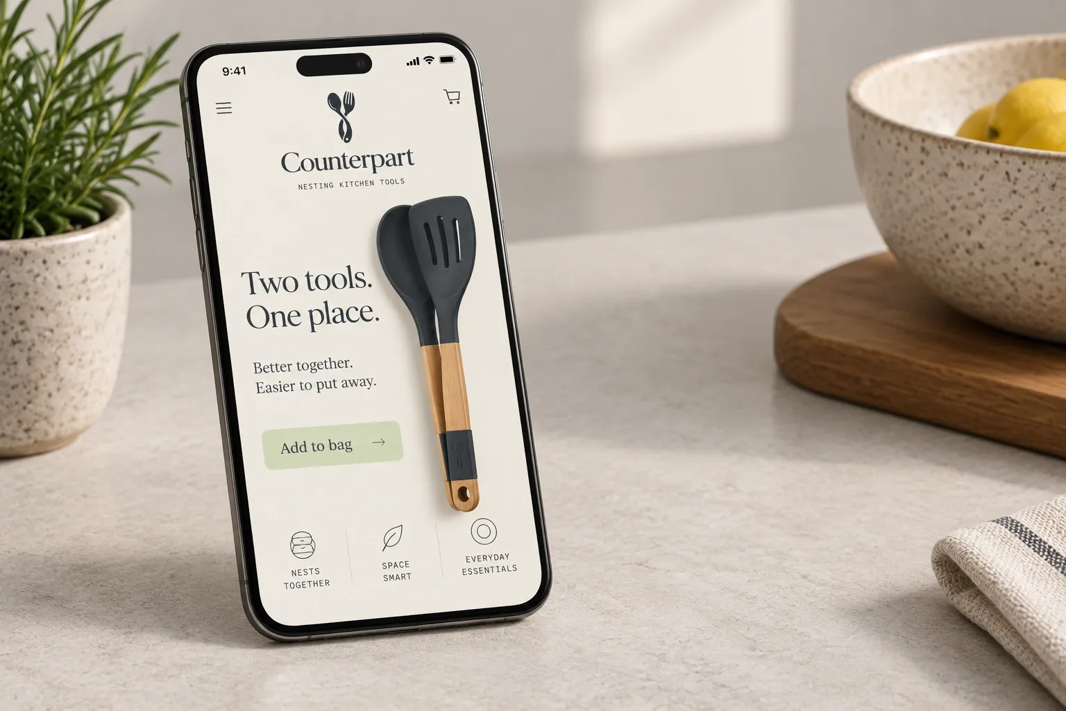
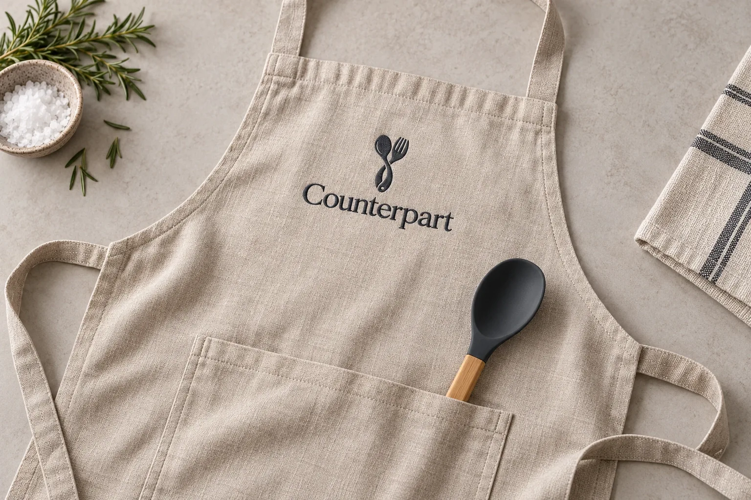
I kept the branding simple on the tools and used the packaging to show how the pieces fit together.
Application mockups · Select an image to take a closer look.