← Branding & visuals

Branding & visuals / Fictional concept

Daymark

A little reminder for brighter days.

A little reminder for brighter days.

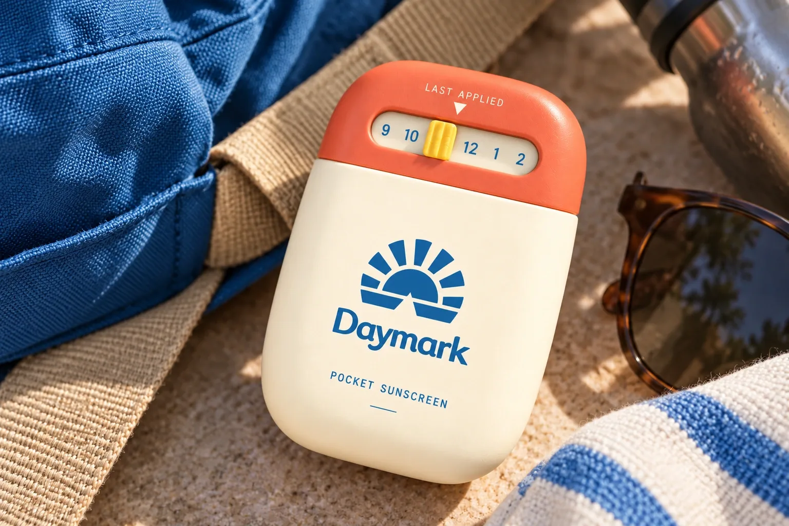
Daymark is a pocket sunscreen concept. A small dial lets you mark when you last applied it. I wanted the brand to feel sunny and easy to find in a bag.
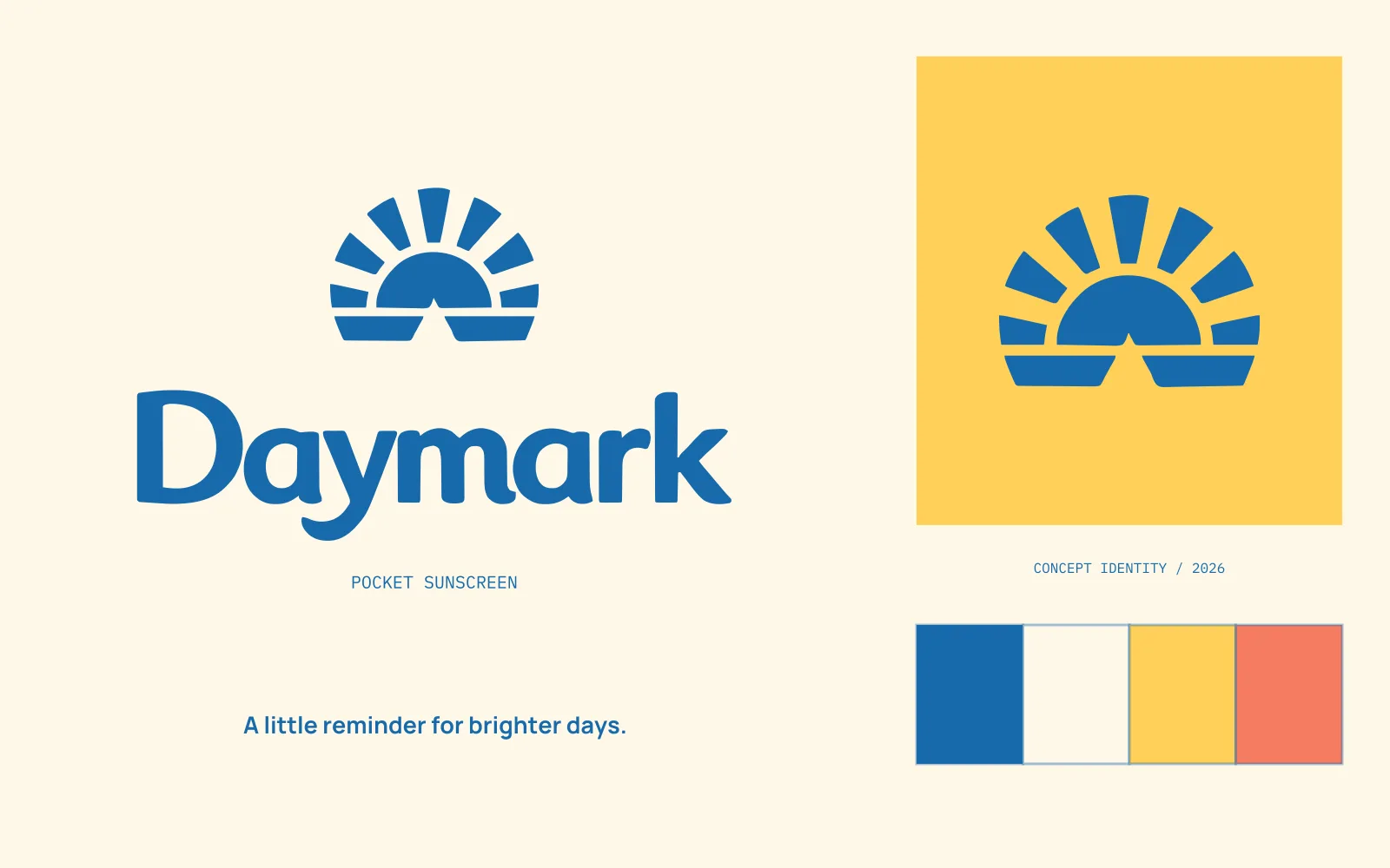
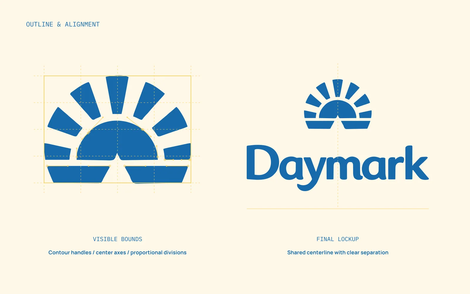
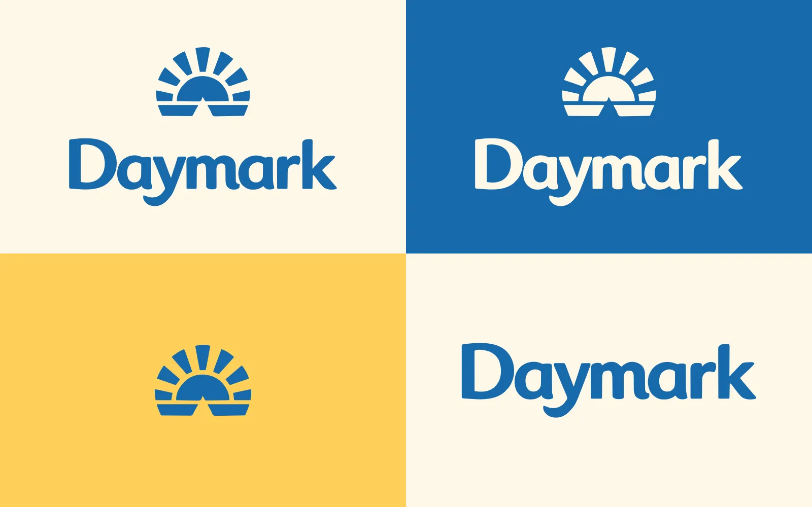
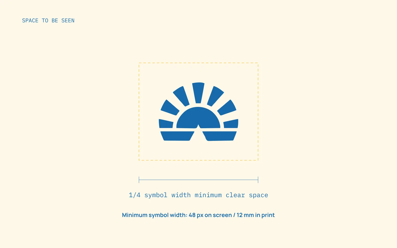
Daymark identity overview
Daymark identity overviewEnlarge ↗

Self-initiated concept · Brand identity / Packaging / Art direction

Colors that fit the idea.

I chose a clear blue with sunny yellow and warm white. A little coral adds warmth, while the blue keeps the name easy to read.
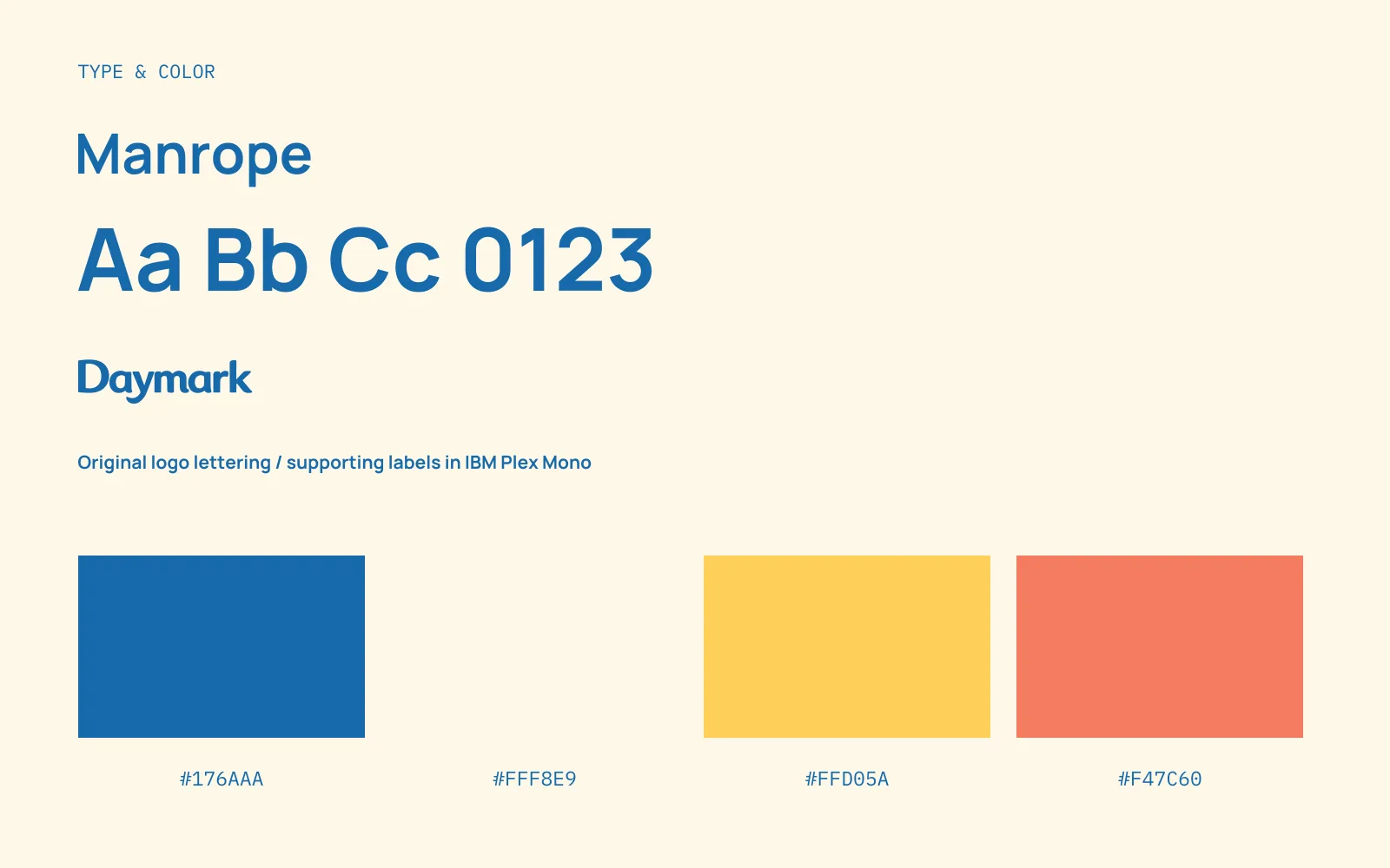

Lettering, fonts, and colors
Lettering, fonts, and colorsEnlarge ↗
Pattern made from the symbol
Pattern made from the symbolEnlarge ↗

The brand in use.

I used the sun on the pack and carried the colors into the product guide and supporting materials.

Application mockups · Select an image to take a closer look.
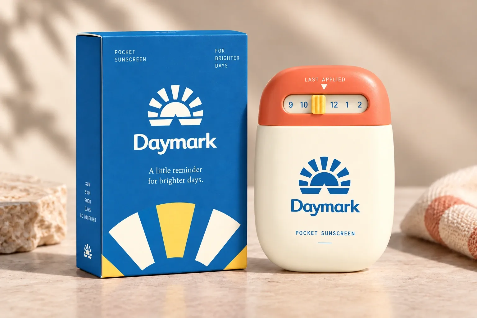
Pocket sunscreen and carton
Pocket sunscreen and cartonEnlarge ↗
Pocket-sized bottle detail
Pocket-sized bottle detailEnlarge ↗
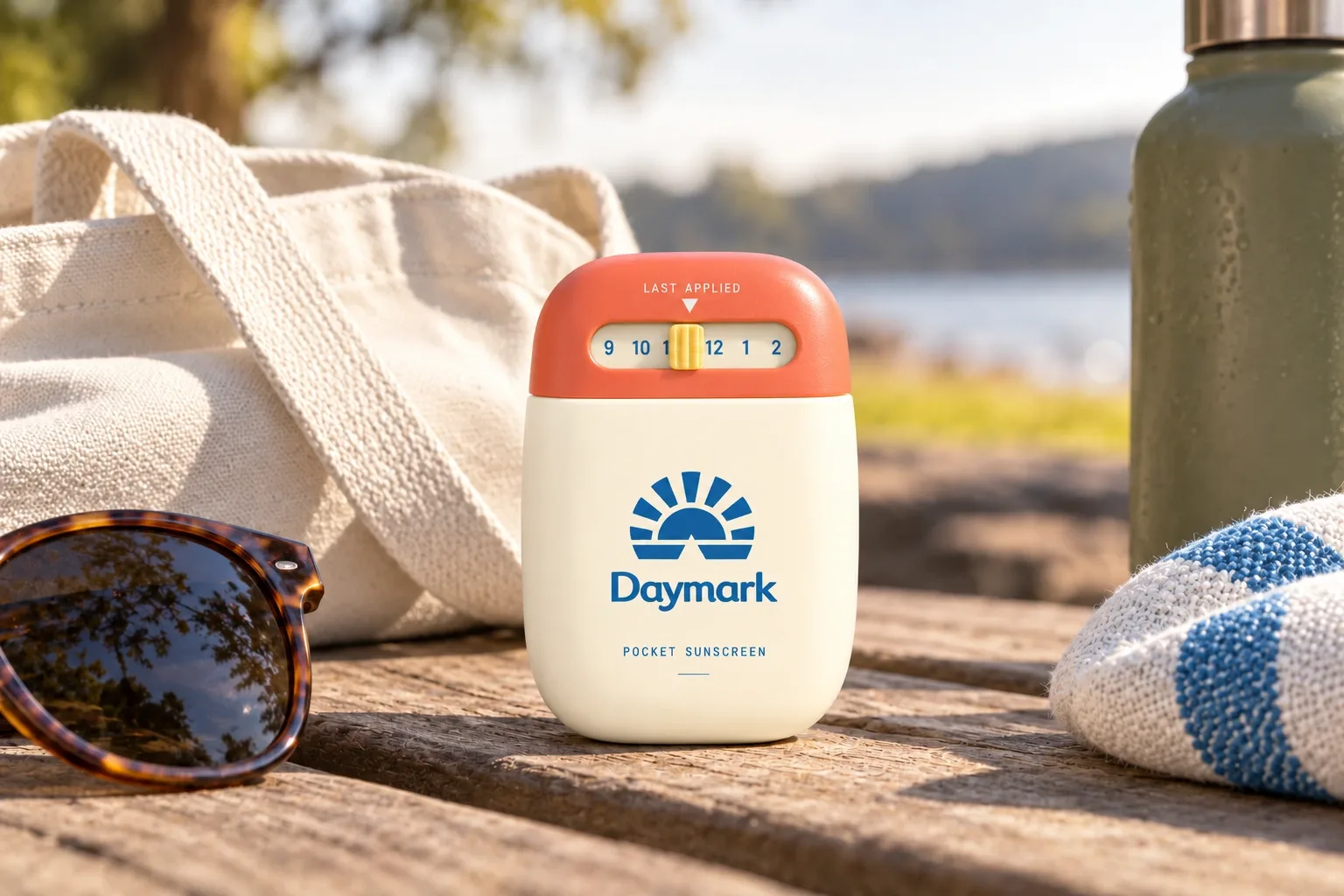
Sunscreen for a day outside
Sunscreen for a day outsideEnlarge ↗
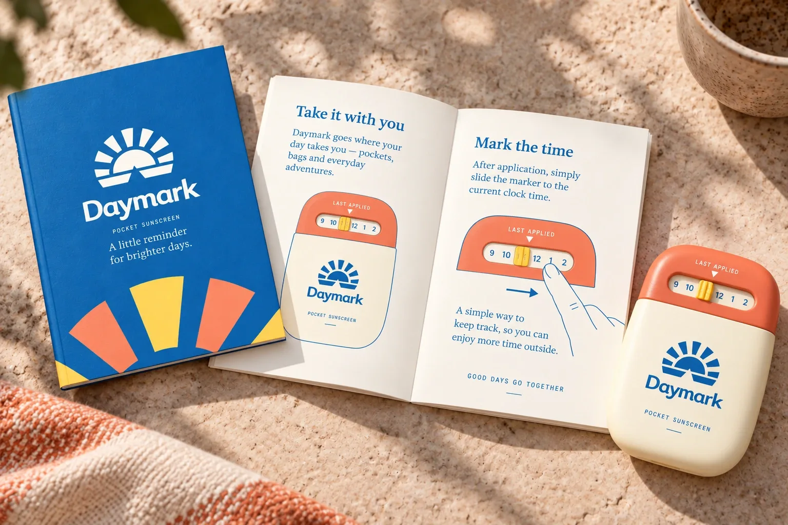
Reapplication guide
Reapplication guideEnlarge ↗
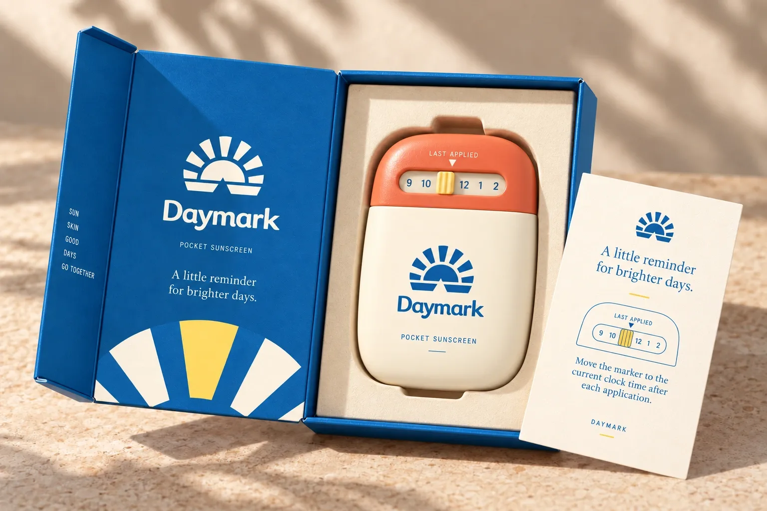
Boxed sunscreen set
Boxed sunscreen setEnlarge ↗
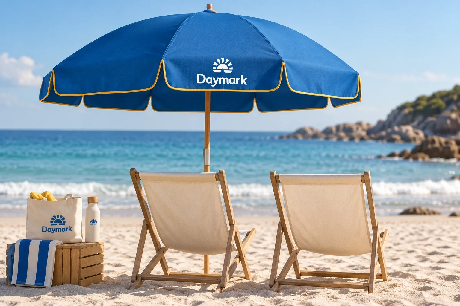
Beach shade campaign
Beach shade campaignEnlarge ↗
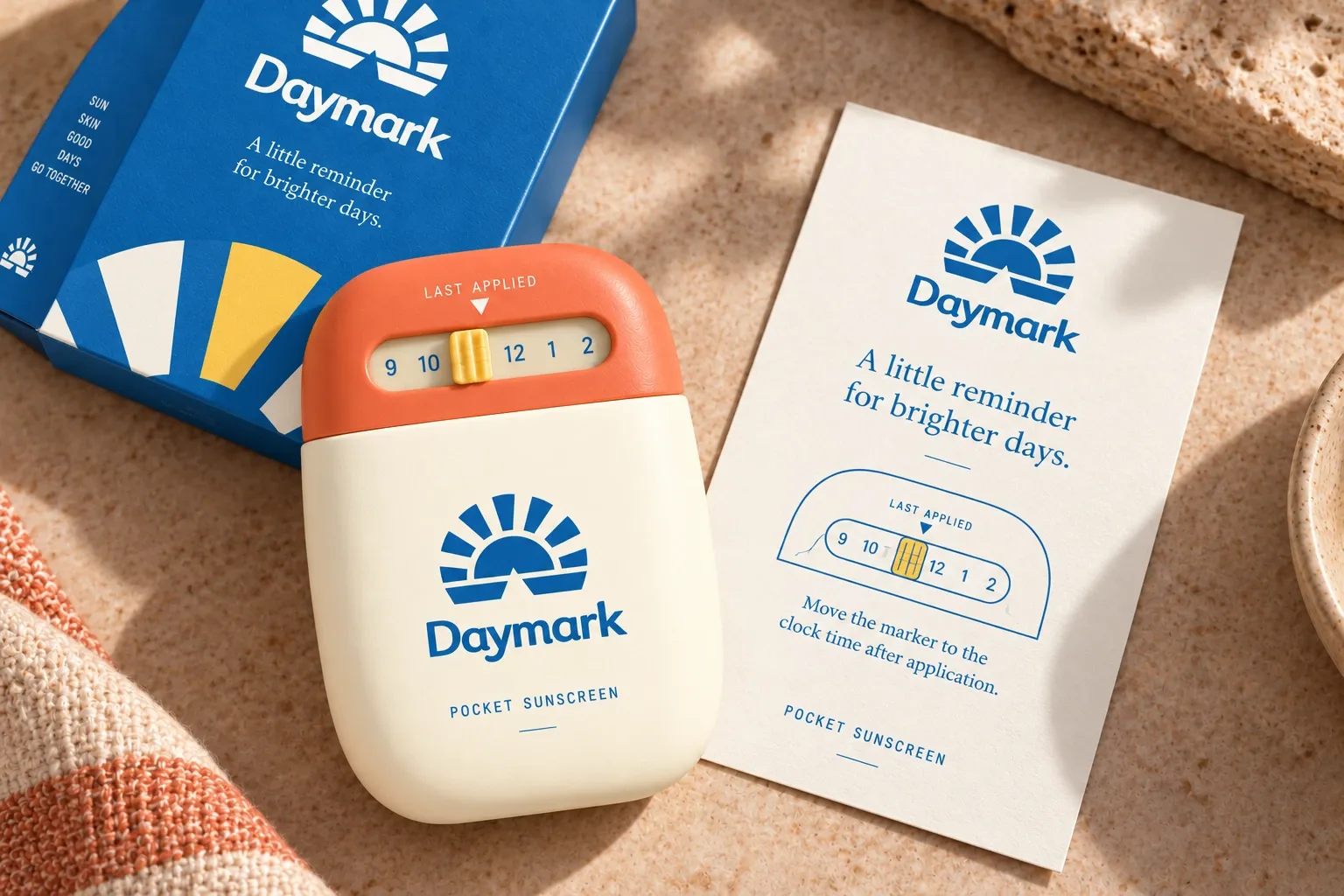
Bottle and reminder card
Bottle and reminder cardEnlarge ↗
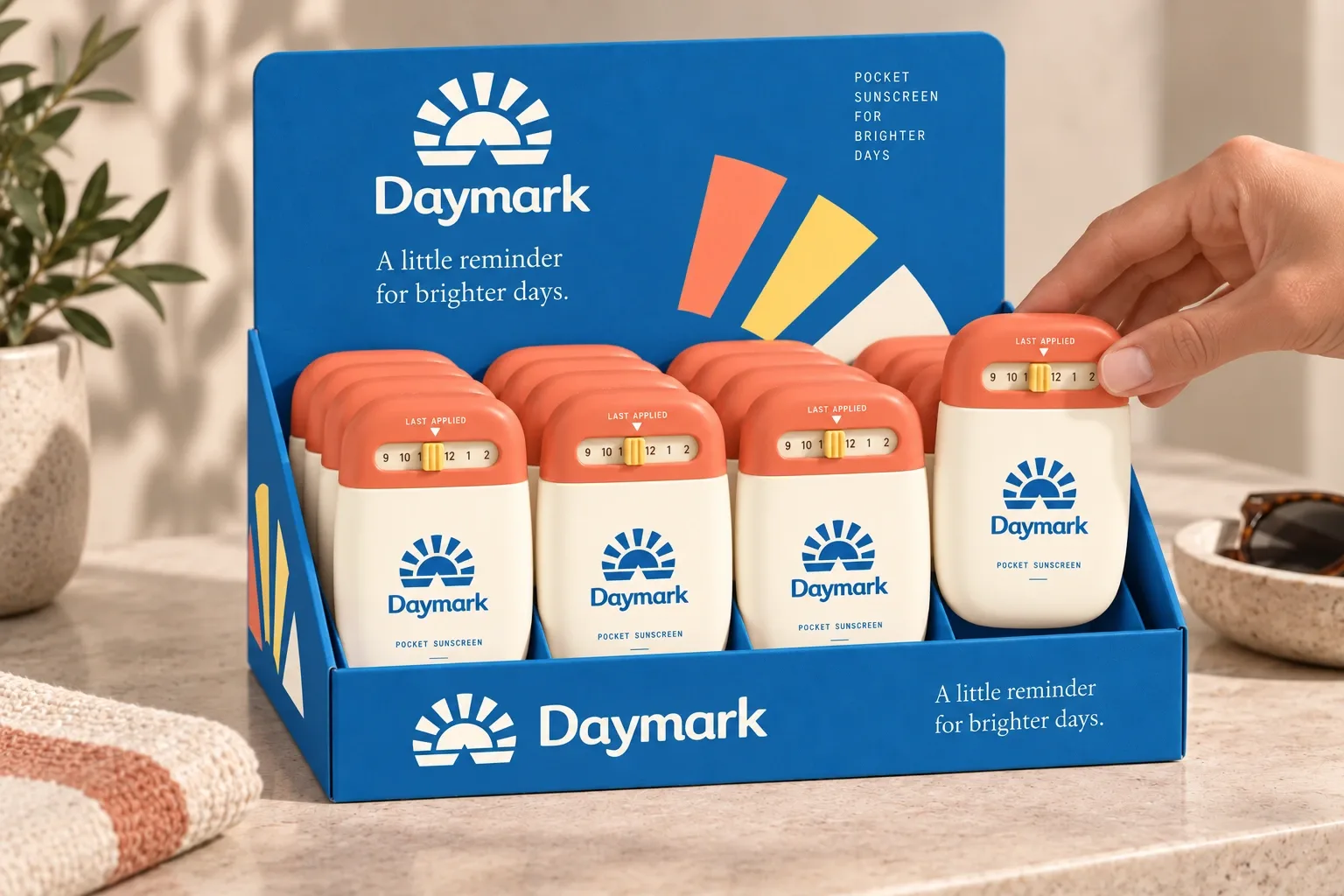
Counter display holding pocket sunscreen bottles
Counter display holding pocket sunscreen bottlesEnlarge ↗
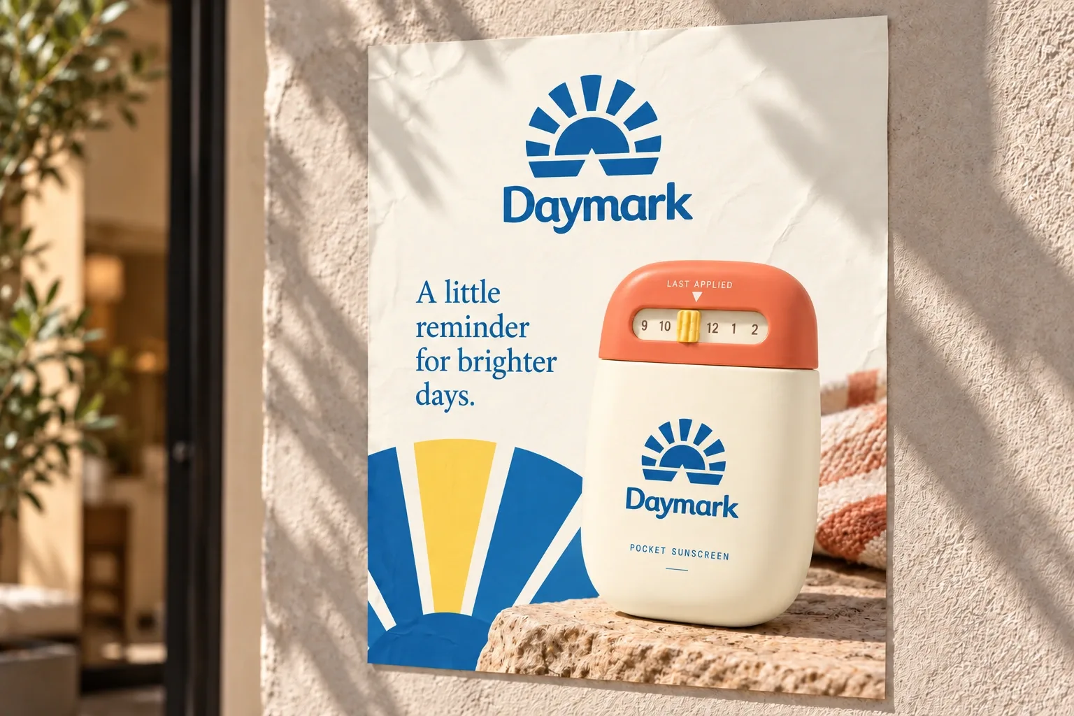
Printed sunny-day campaign poster
Printed sunny-day campaign posterEnlarge ↗
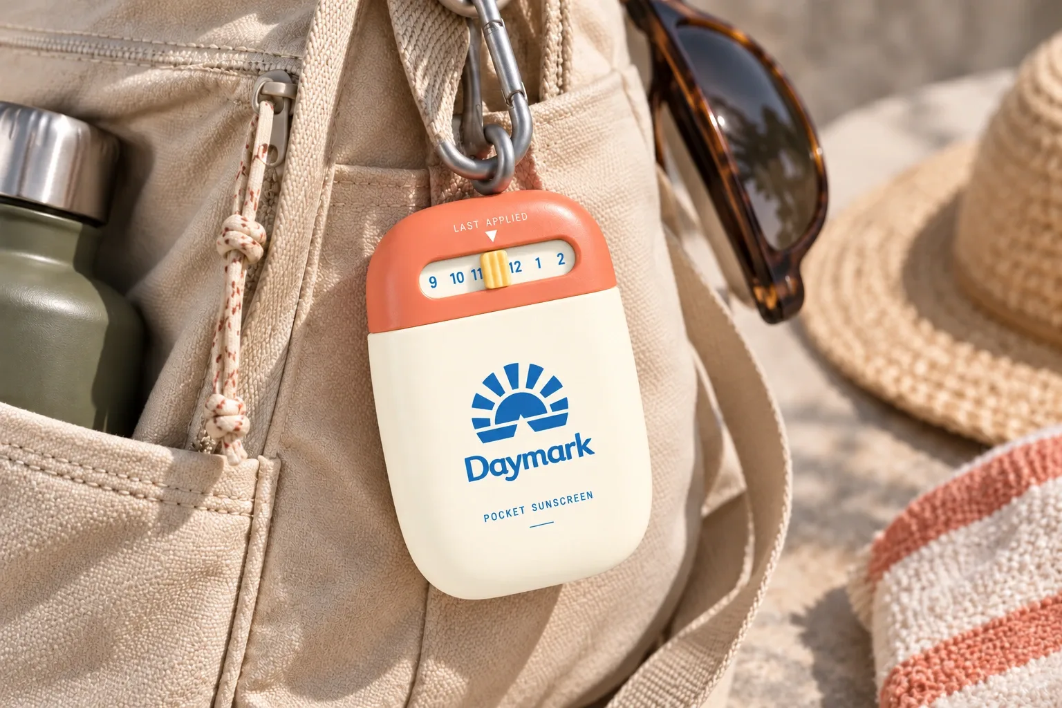
Bottle clipped inside a day bag with readable dial
Bottle clipped inside a day bag with readable dialEnlarge ↗
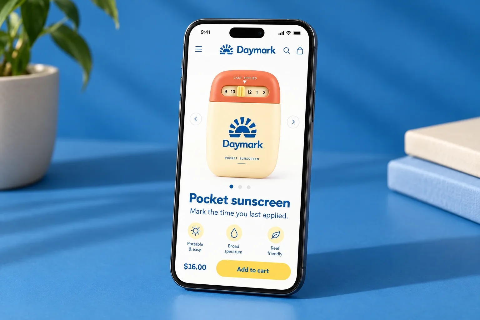
Mobile product page showing cap reminder instructions
Mobile product page showing cap reminder instructionsEnlarge ↗
View campaign artwork
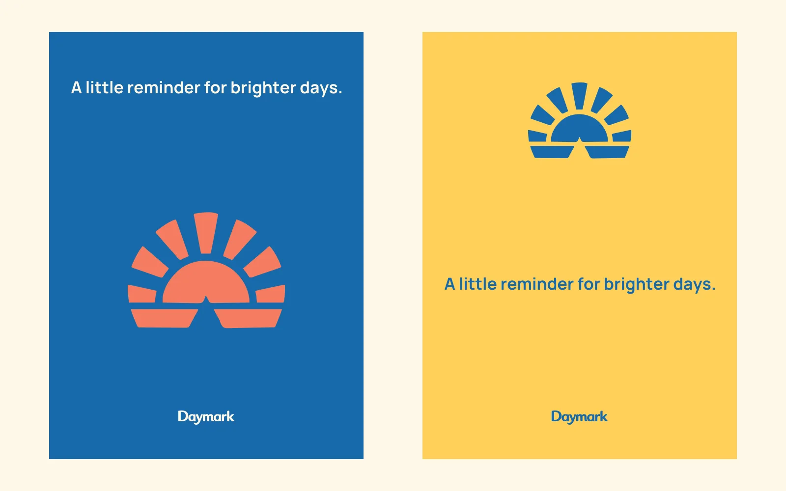
Poster compositions
Poster compositionsEnlarge ↗
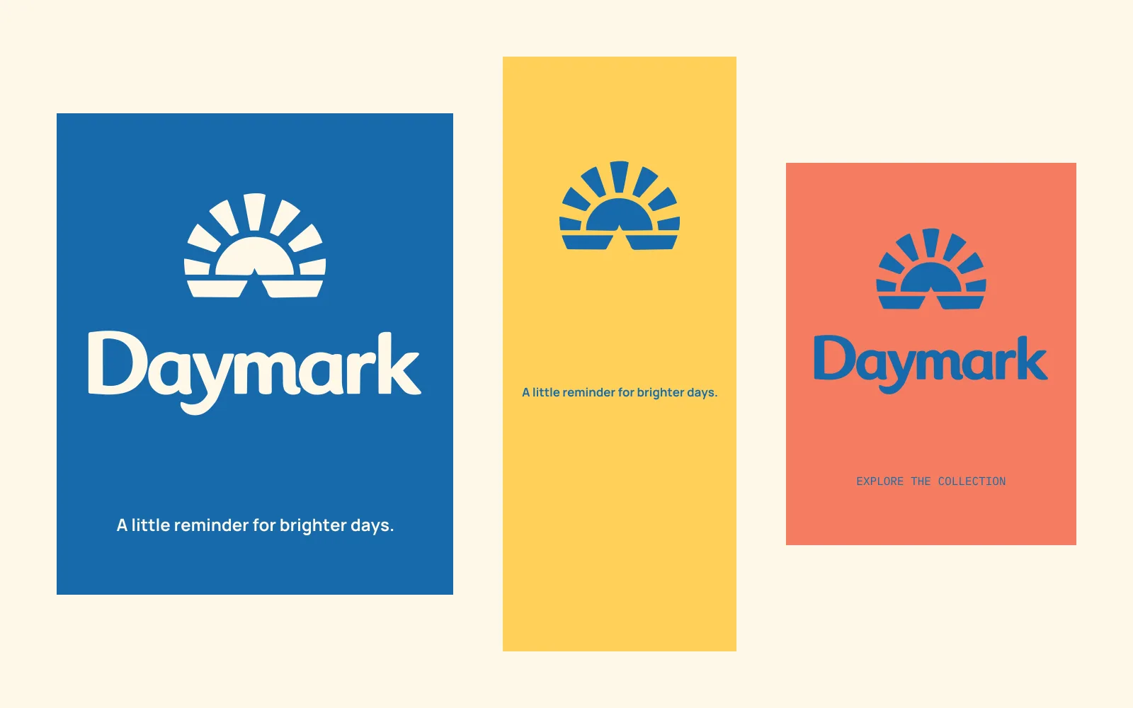
Digital campaign formats
Digital campaign formatsEnlarge ↗