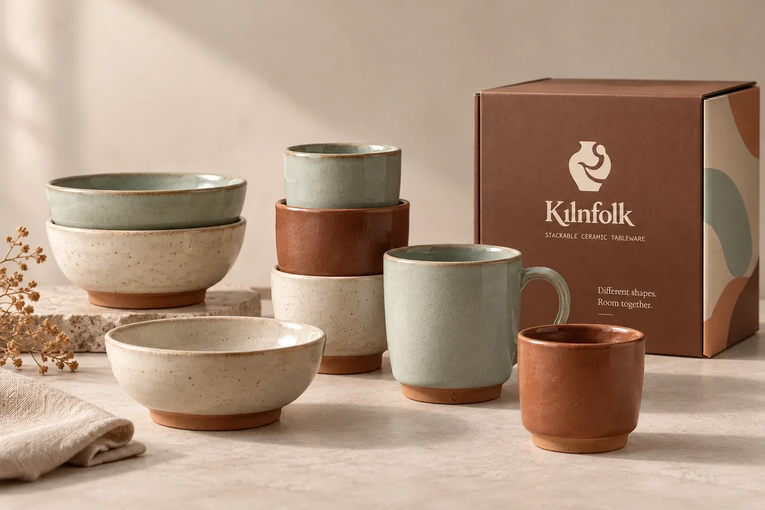
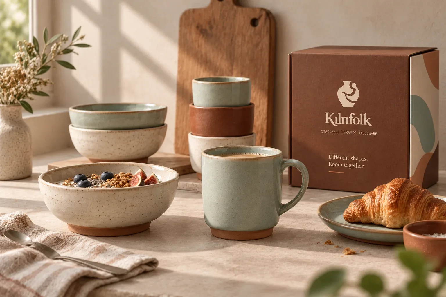
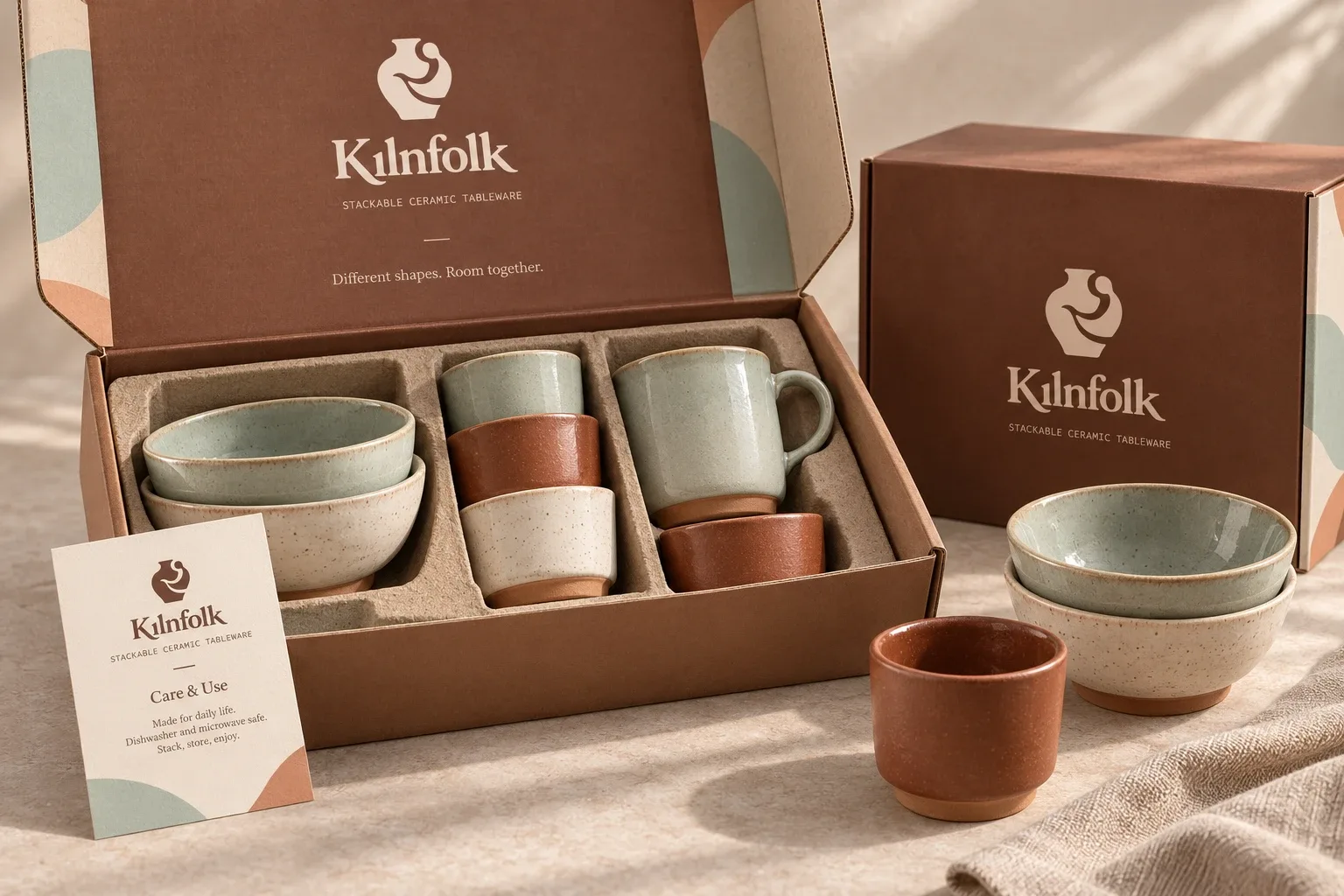
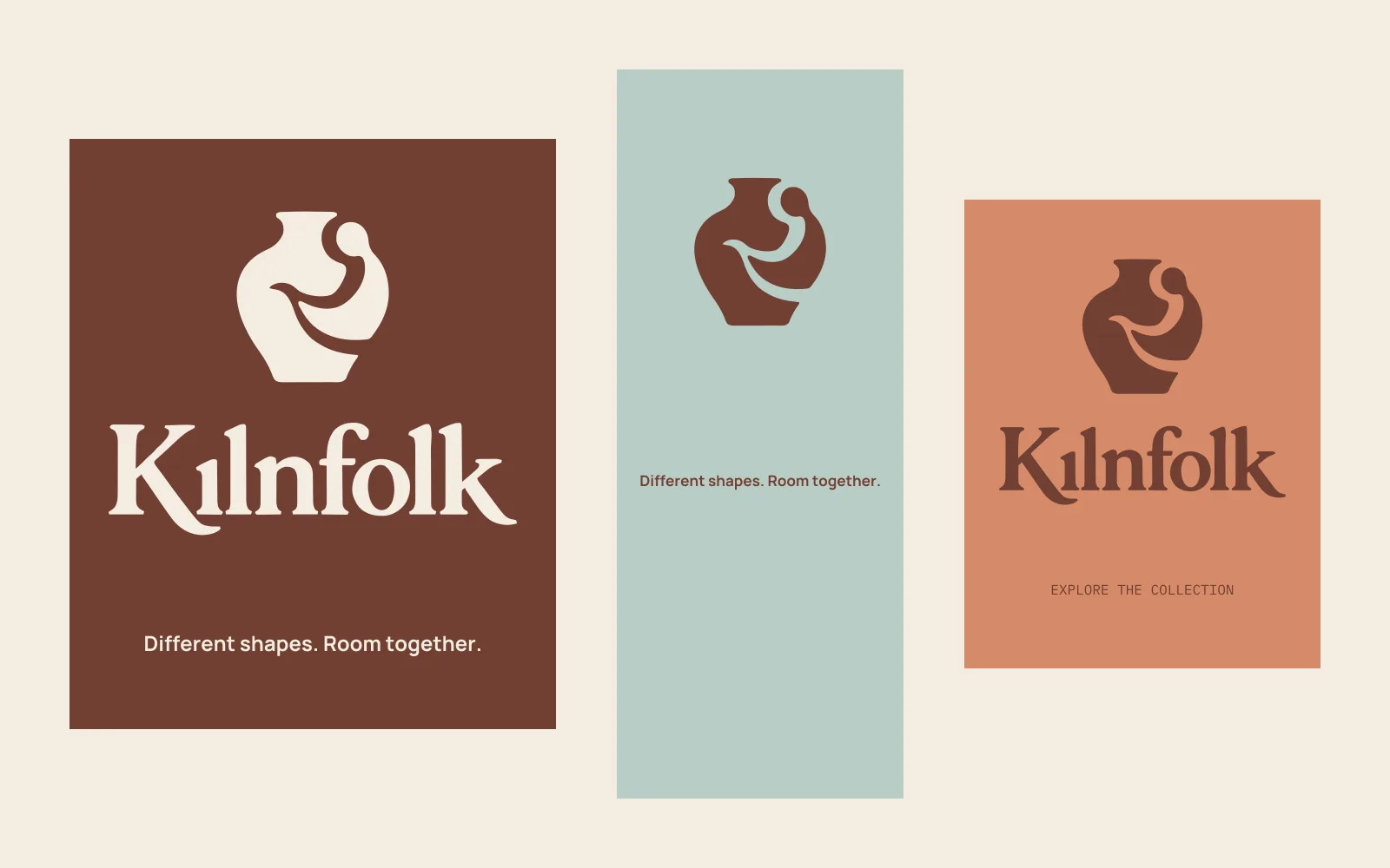
Different shapes. Room together.
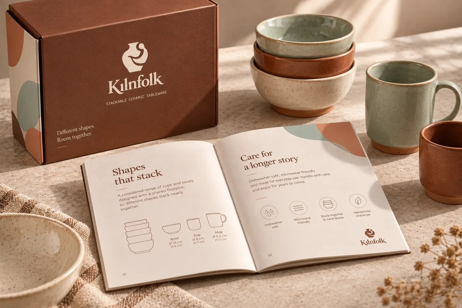
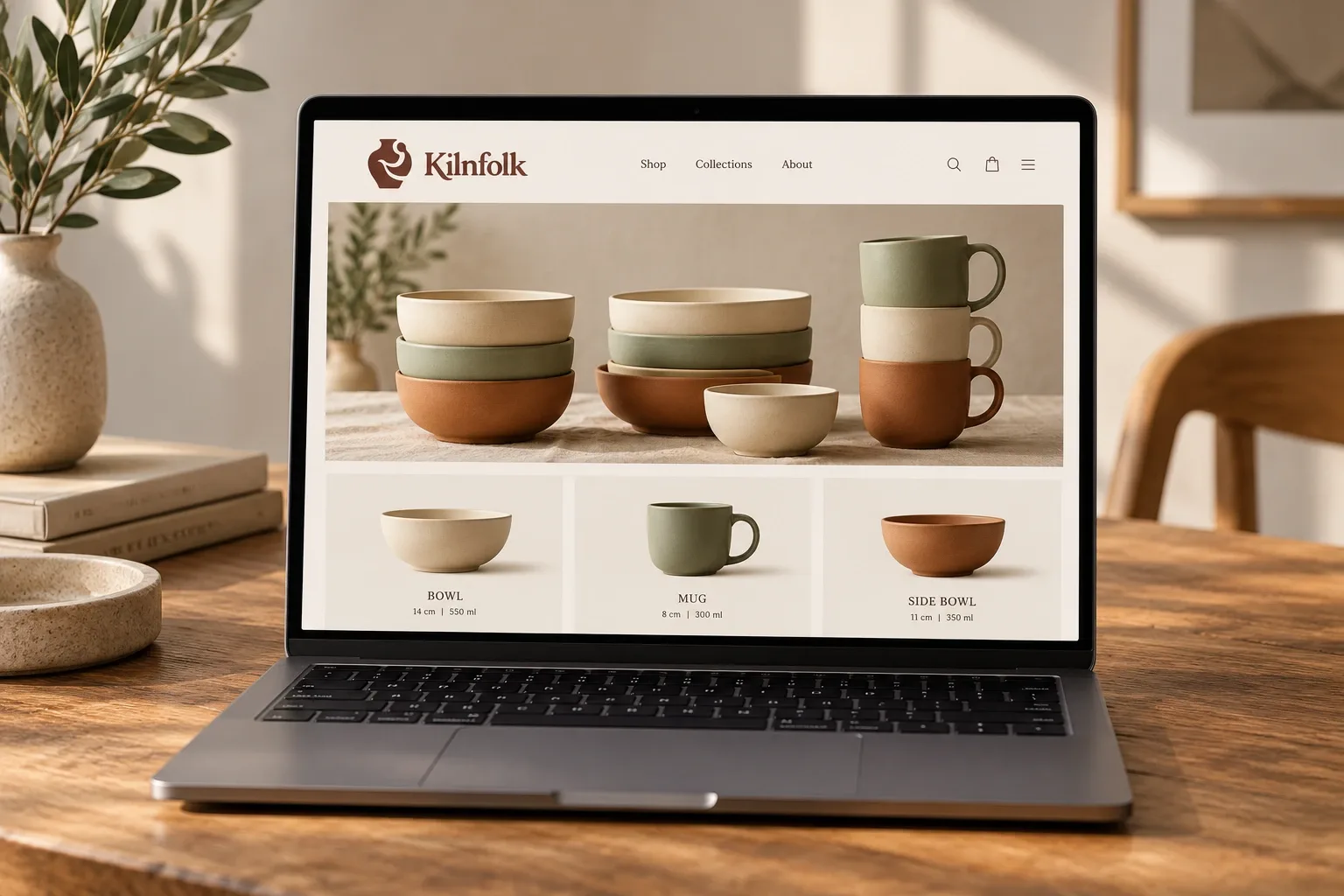
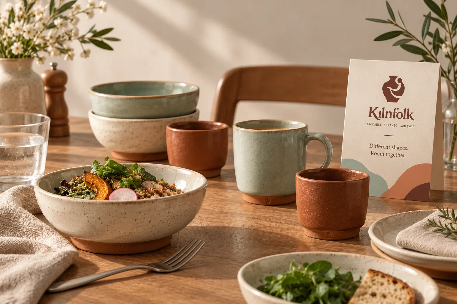
Kilnfolk is a ceramic tableware concept. Different cups and bowls share a base size, so a mixed set can still stack neatly. I wanted the brand to feel personal and handmade.
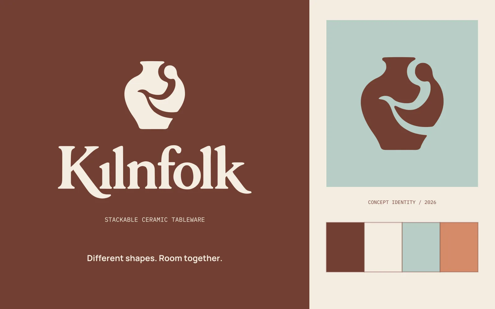
Self-initiated concept · Brand identity / Packaging / Art direction
The idea in the mark.
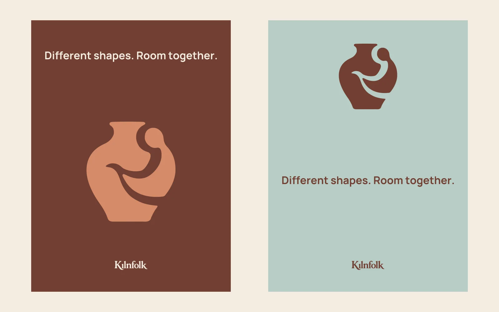
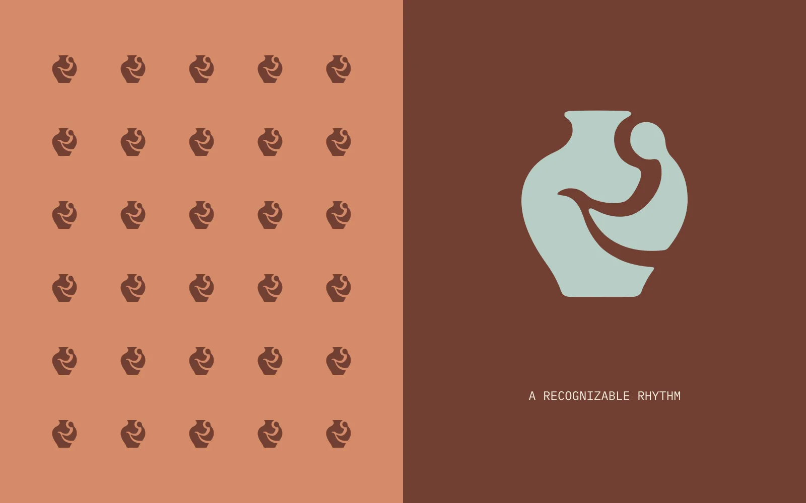
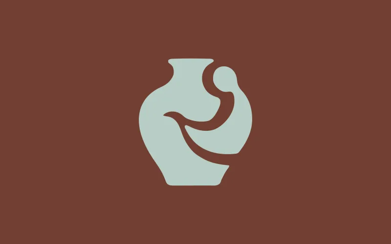
I brought a person and a vessel into one shape. The space between them keeps both easy to see.
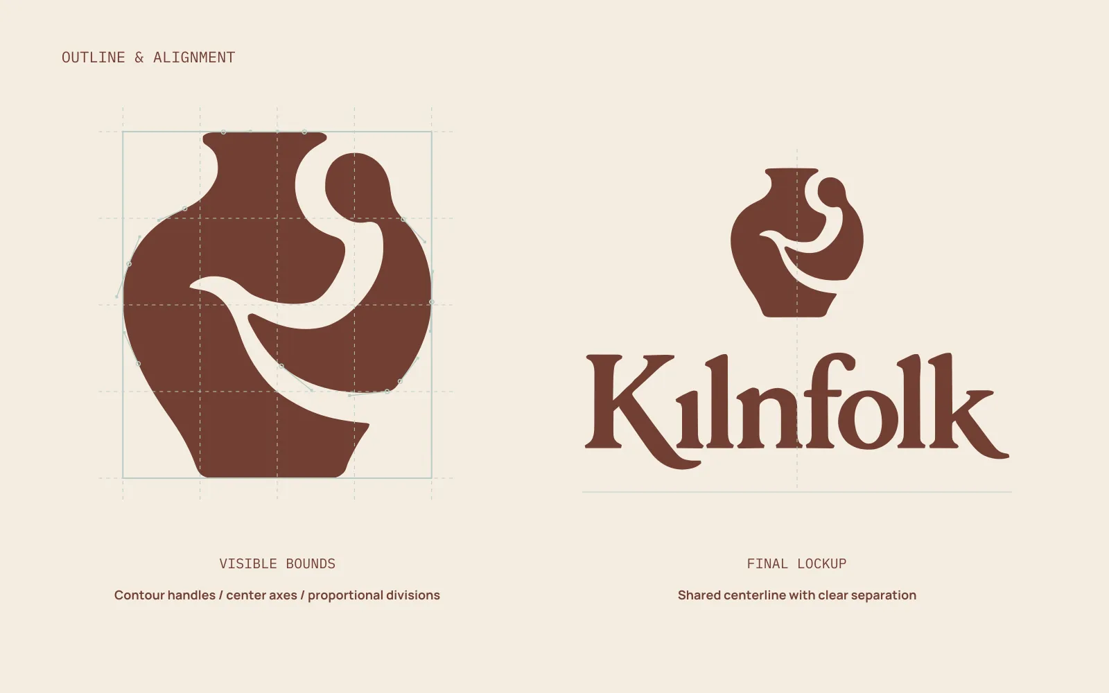
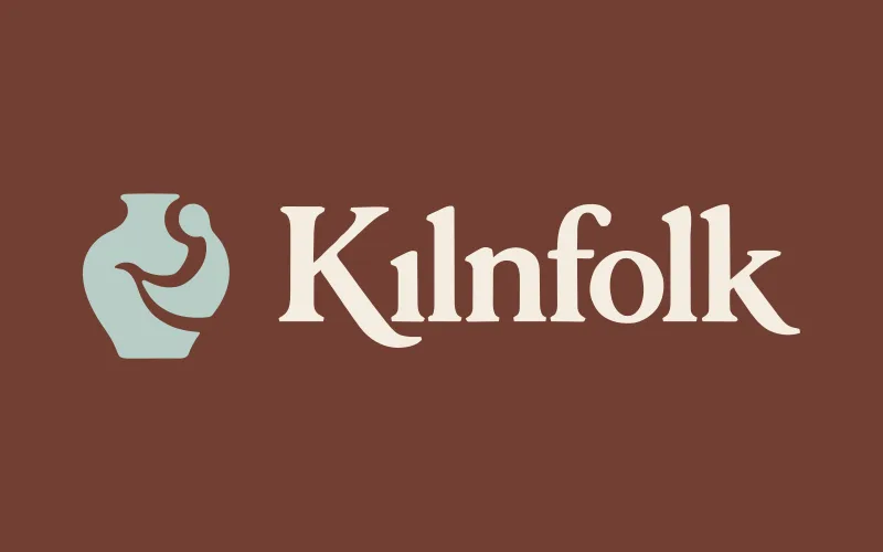
I used the final outline to check the curves, spacing, and alignment. Each version uses the same mark and lettering.
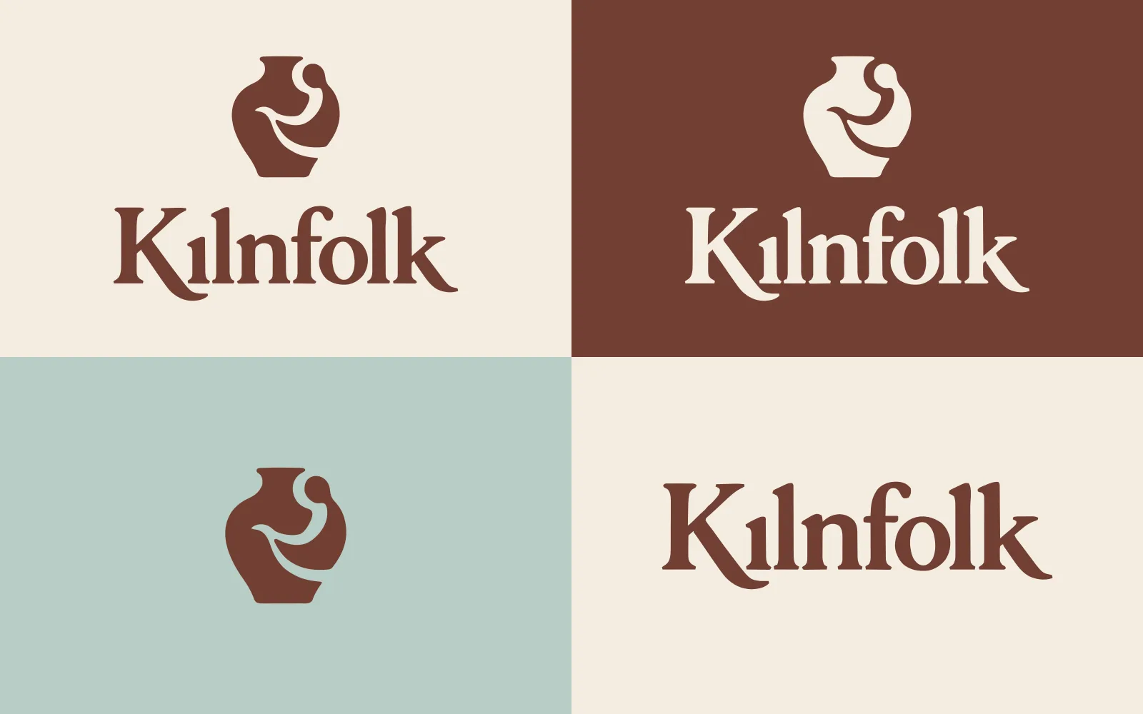
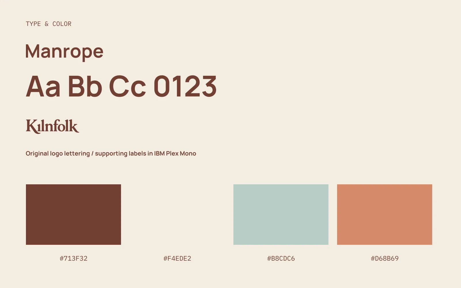
The brand in use.
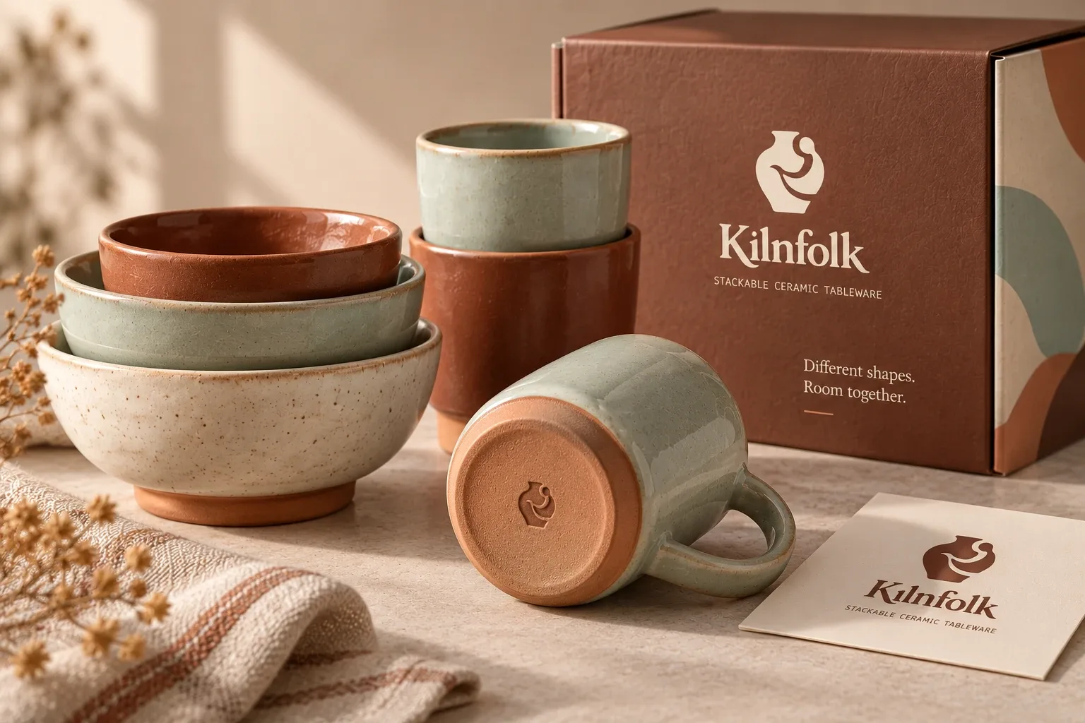
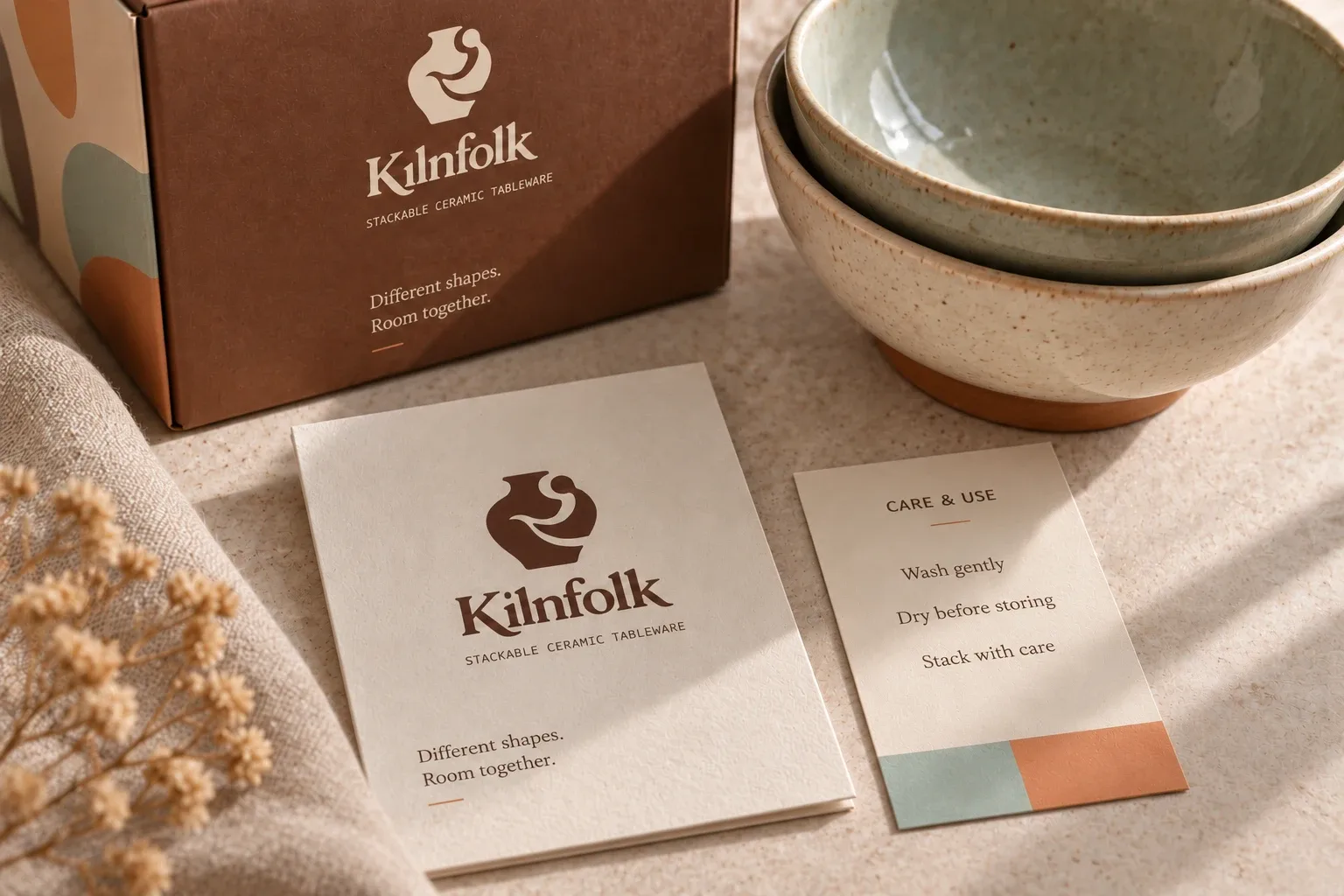
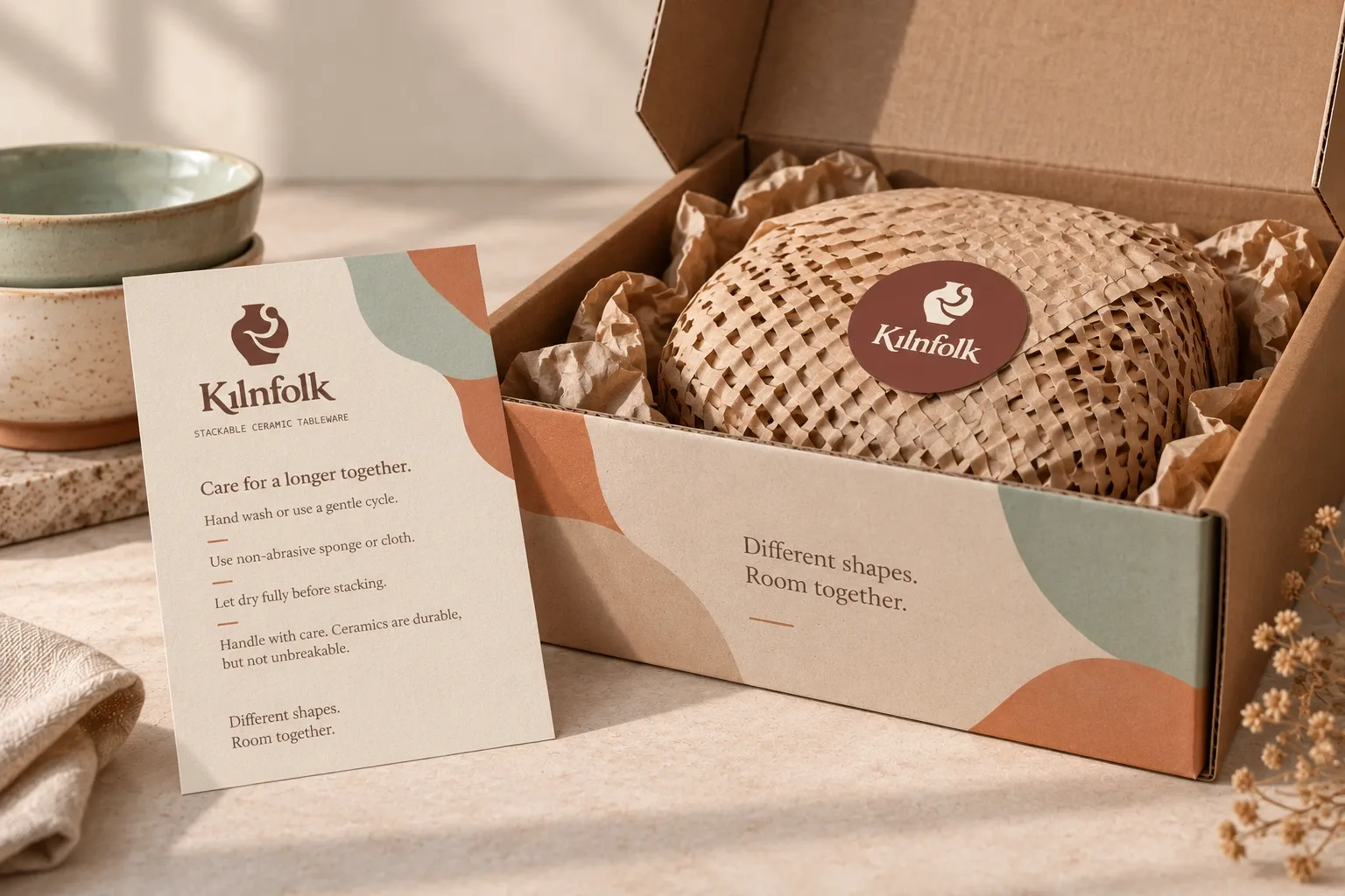
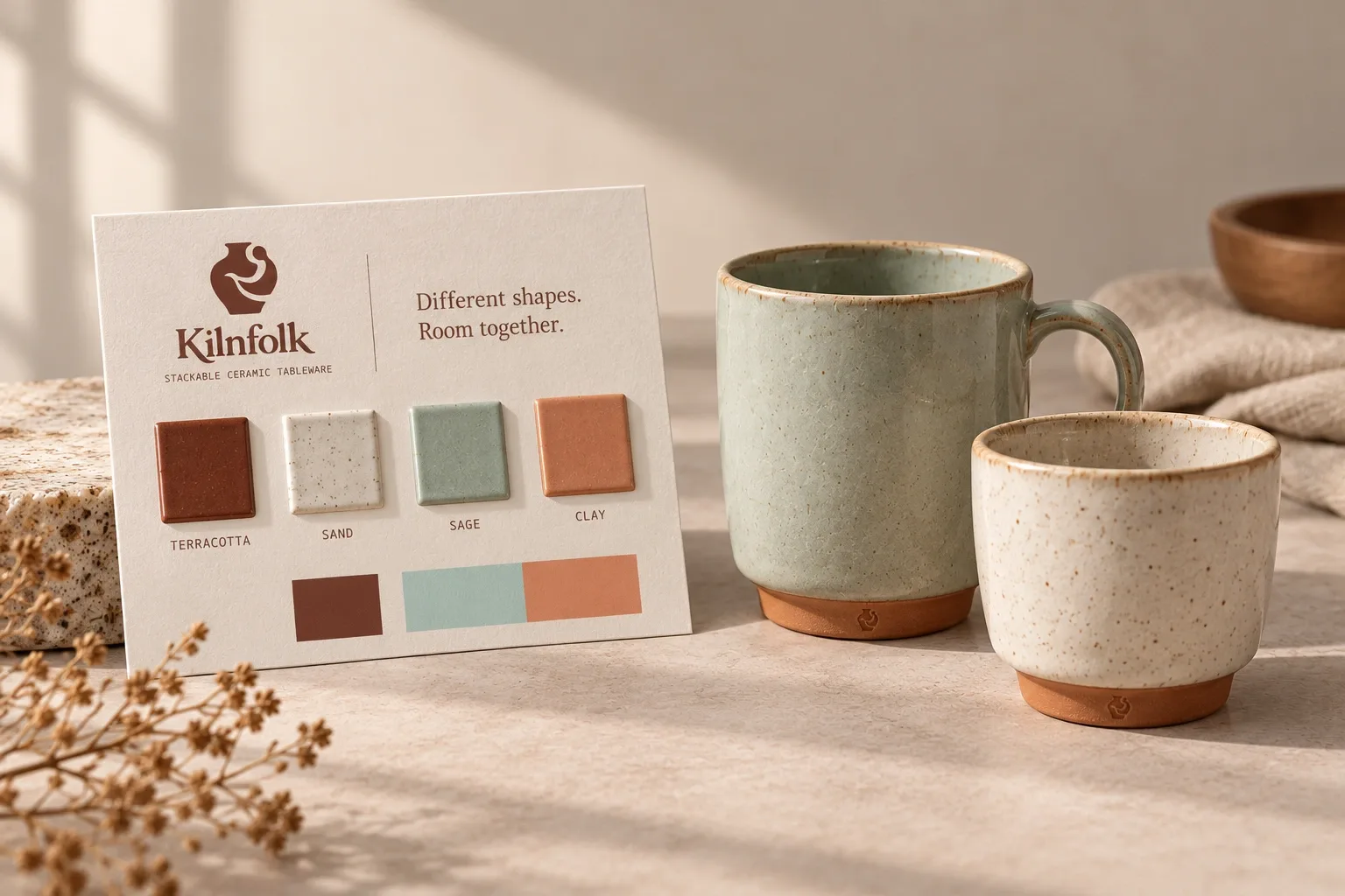
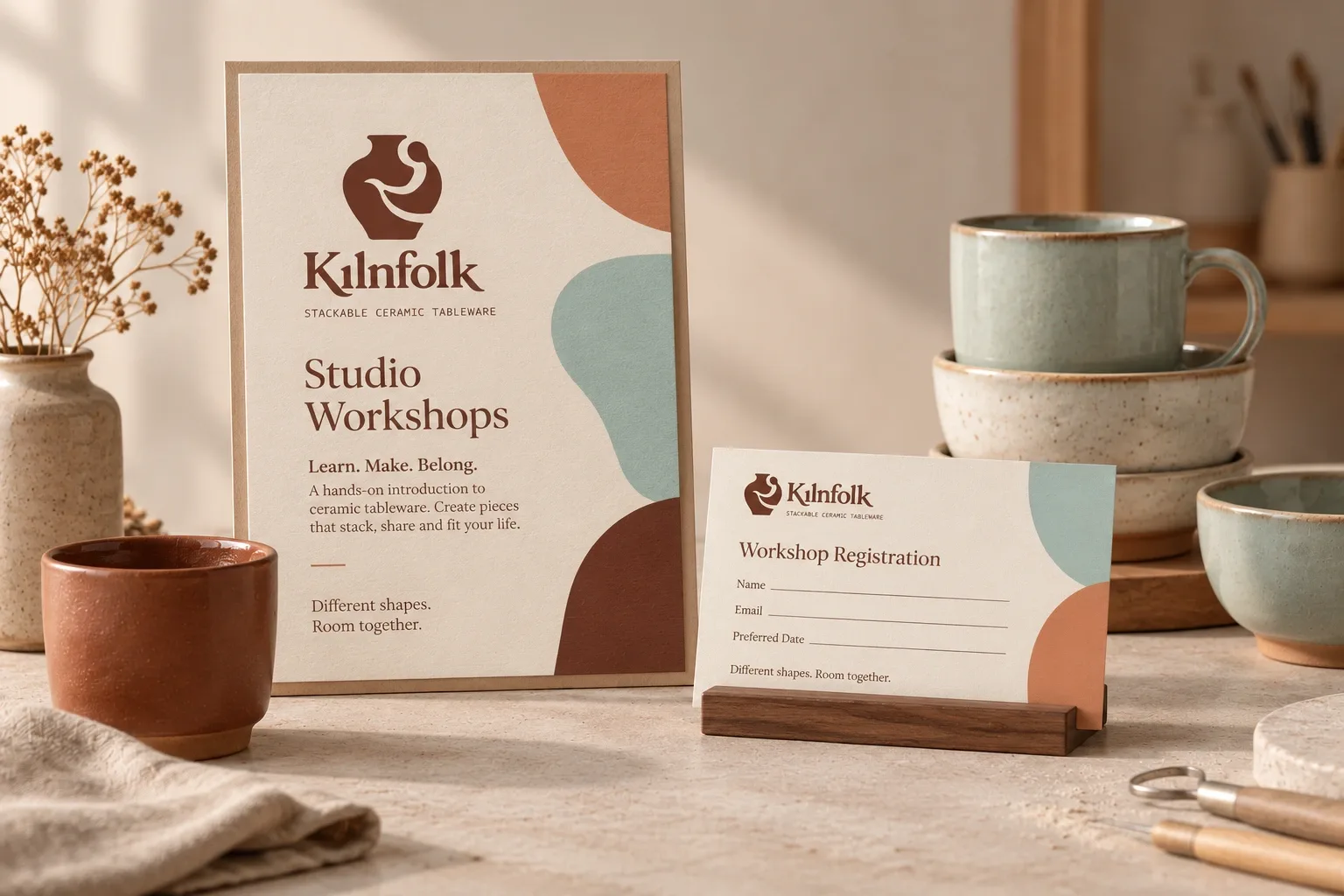
I used a small maker’s mark on the ceramics, with the full logo on packaging and printed pieces.
Application mockups · Select an image to take a closer look.