Websites & Apps / Personal project
This portfolio.
A place for my work that feels like me. Simple to explore, with enough room for the details.
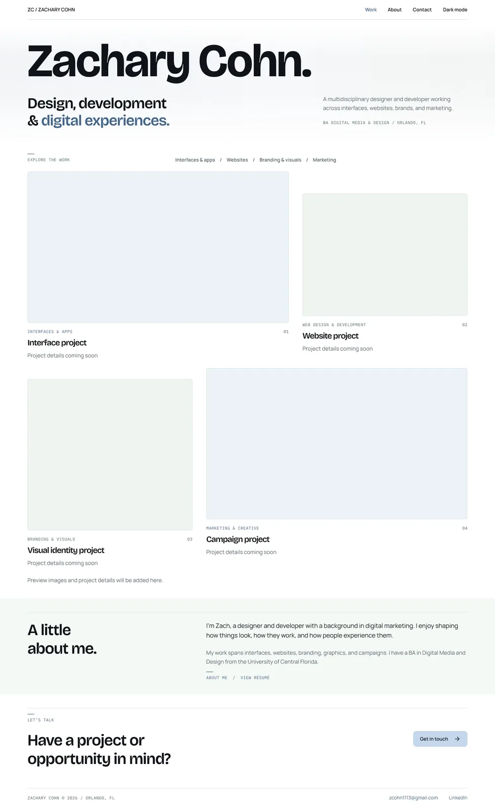

More than one kind of work.
I work across websites, interfaces, branding, and marketing. I wanted a portfolio that made room for all of that, without making visitors dig through one long project list.
What I focused on
I set the direction, chose what belonged on each page, and kept refining the details. The biggest decisions were about structure, typography, and making the site feel personal.
Less sales pitch. More of my work.
The early versions felt too much like a sales pitch. I wanted the work to do more of the talking.
A clear way into the work
Home gives you a quick introduction. Each type of work has its own page, and each project has room for the story behind it. Personal experiments have a place too.
Character in the details
The headings have a little personality, the body text stays easy to read, and blue does most of the accent work. I tried stronger backgrounds and more movement, then pulled them back. The quieter version feels better.
Designed for the smaller screen, too.
I wanted mobile to feel considered, not squeezed down. The layout stacks, the navigation gets its own space, and the work stays easy to browse.

Explore the Figma file
Figma / Complete design file
Explore the full design.
Choose a page to explore its desktop and mobile designs in light or dark.
Design file / All website screens
Give it a look around.
The site will keep changing as I add projects. For now, you can explore the pages, switch themes, and see how it all fits together.