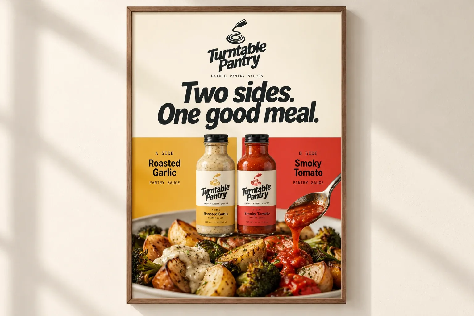
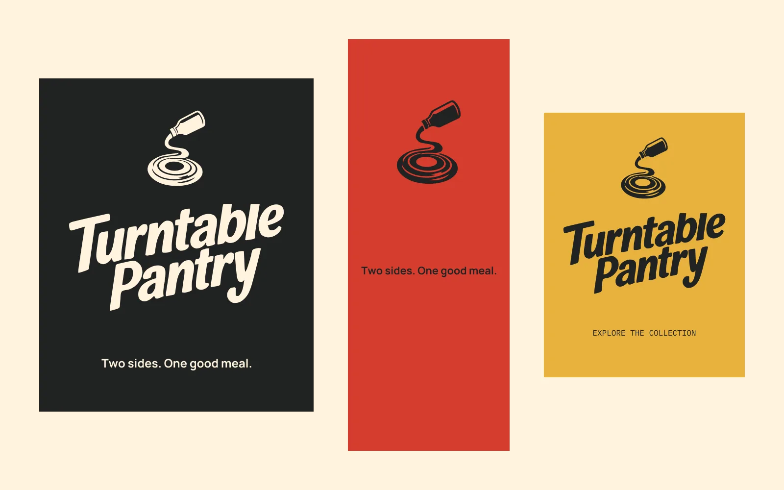
Two sides. One good meal.
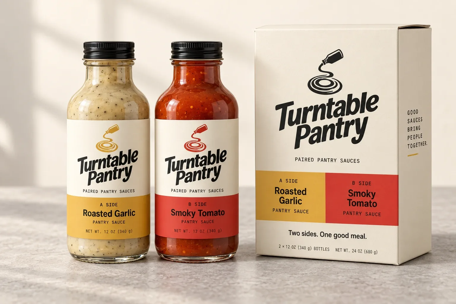
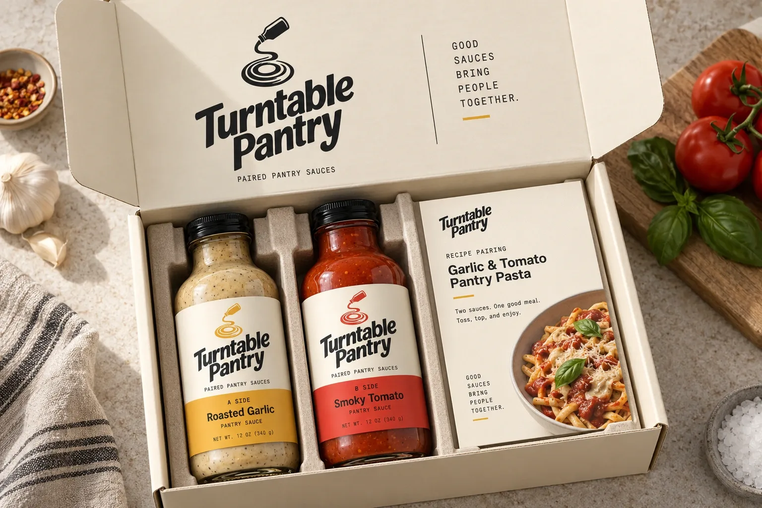
Turntable Pantry is a sauce brand concept. Each pair comes as an A-side and B-side, with two flavors to try together or on their own. I wanted the music idea to add personality while keeping the food first.
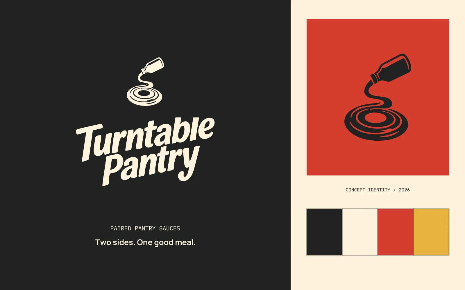
Self-initiated concept · Brand identity / Packaging / Art direction
The idea in the mark.
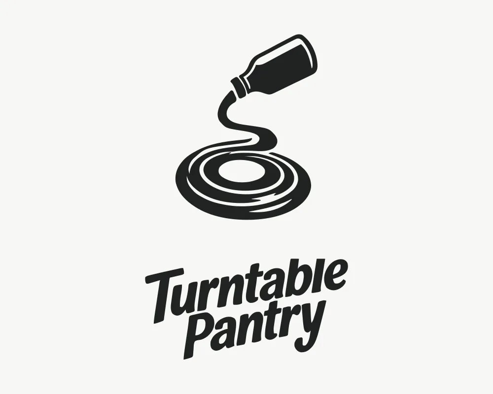
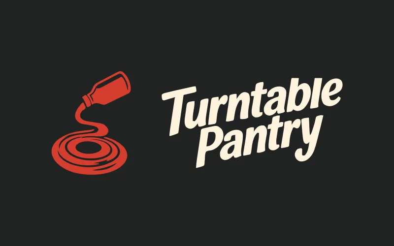
I made the sauce pouring from a bottle turn into a record groove. It connects the product to the name in one shape.
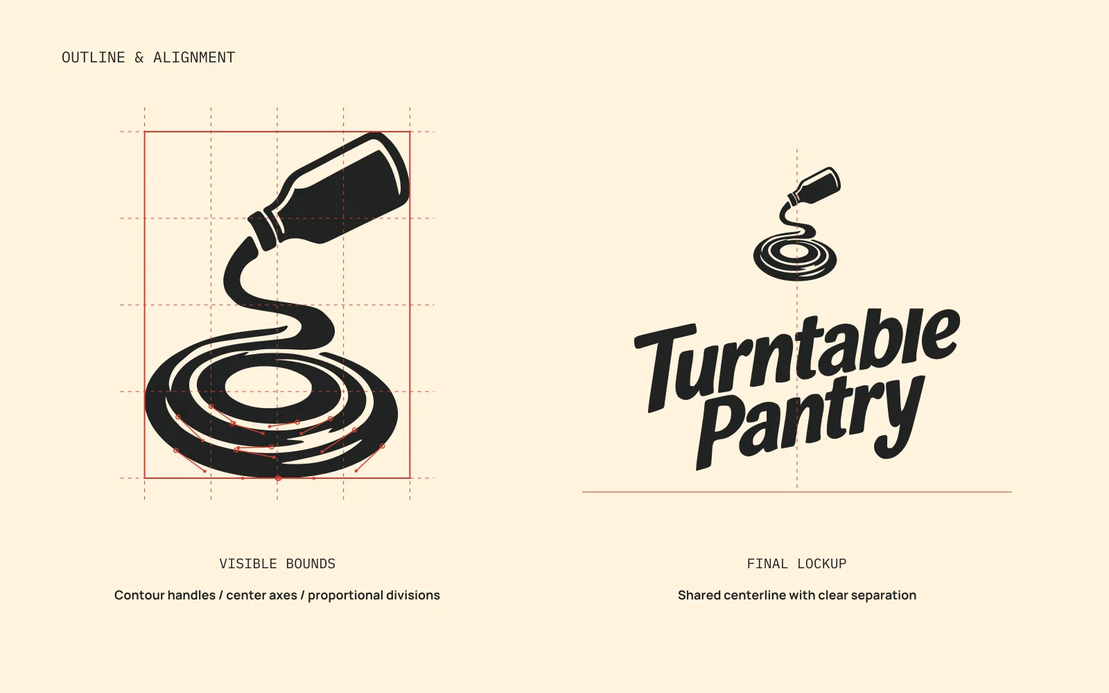
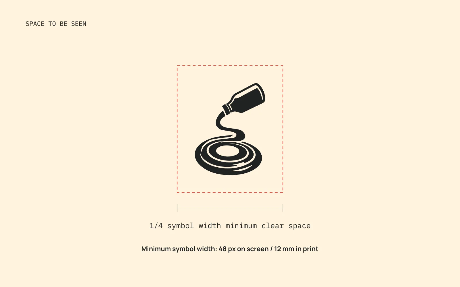
I used the final outline to check the curves, spacing, and alignment. Each version uses the same mark and lettering.
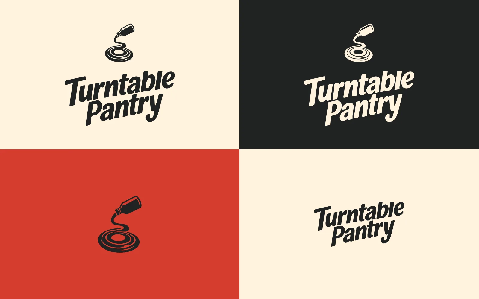


Colors that fit the idea.
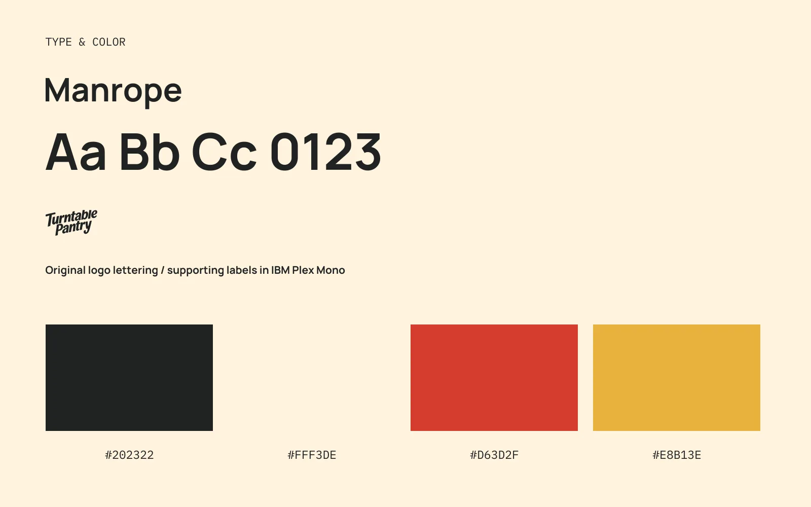
I chose tomato red and mustard yellow to put the sauces first. Charcoal keeps the name clear, with cream to give the labels some space.
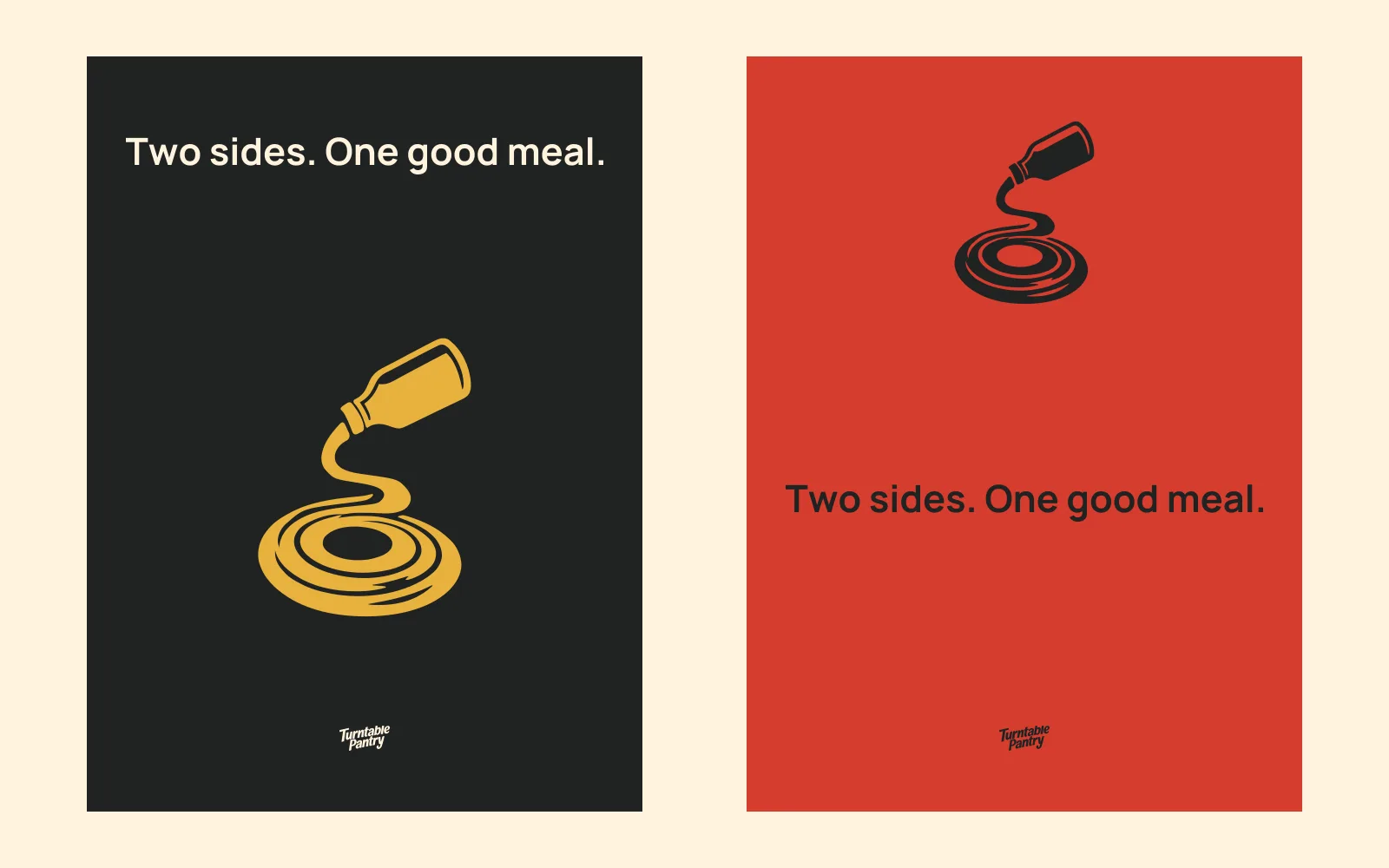
Another way to use the colors.
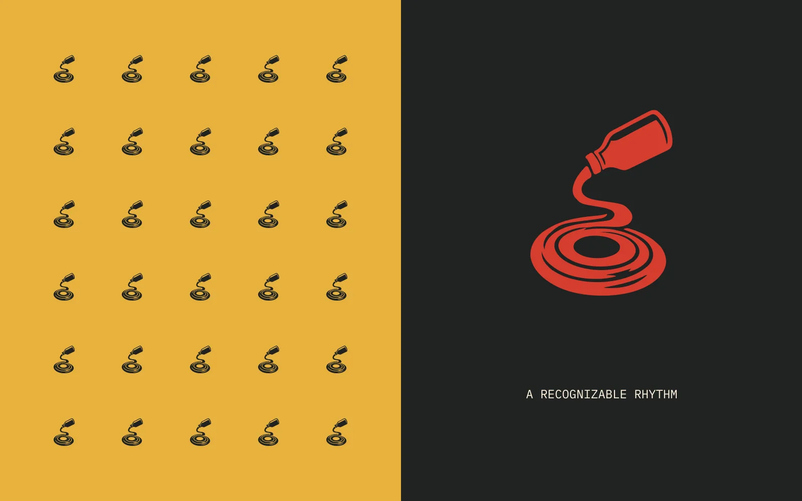
The same logo, using the brand palette.

The brand in use.
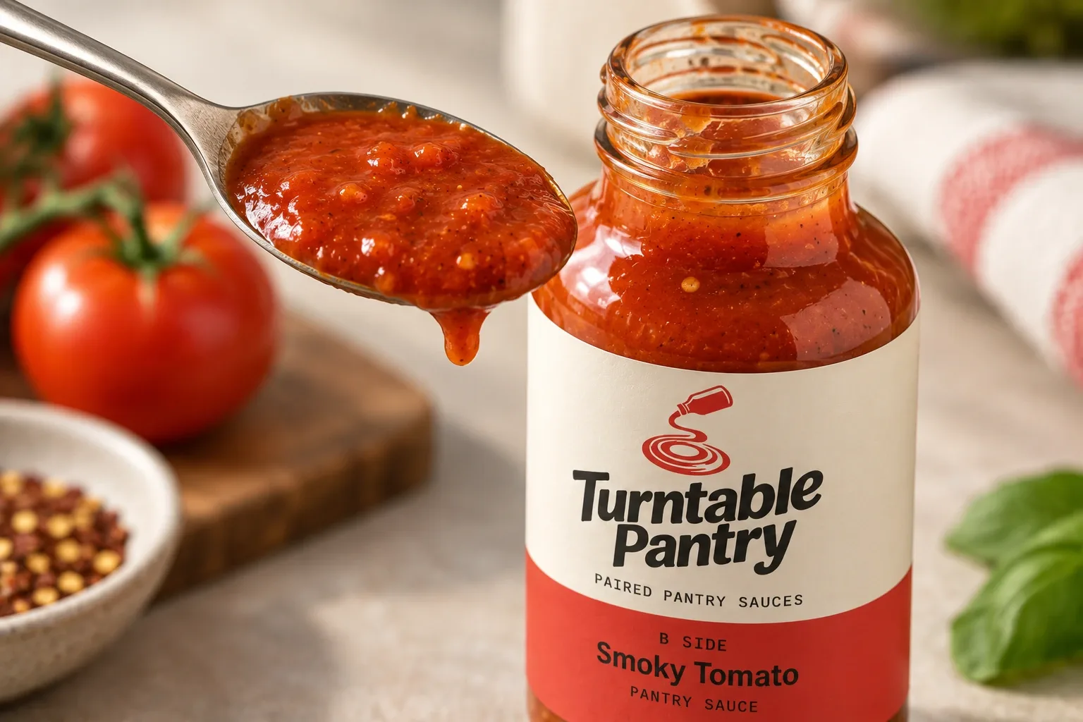
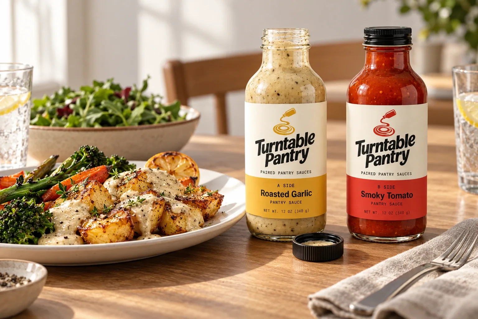
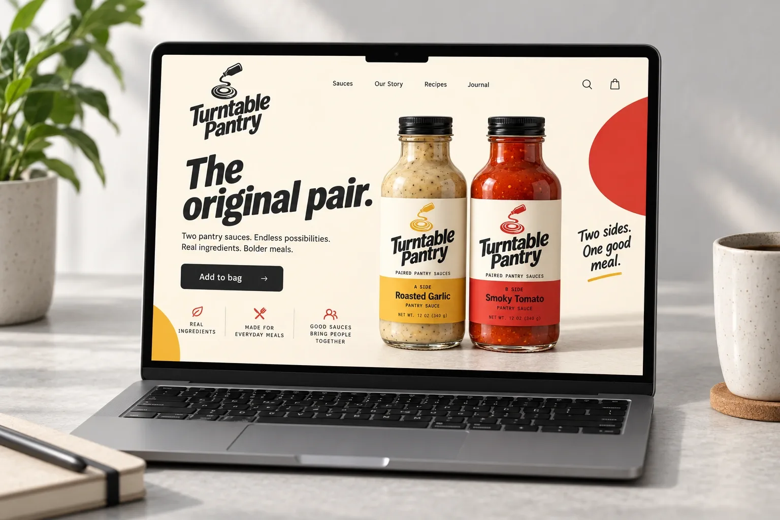
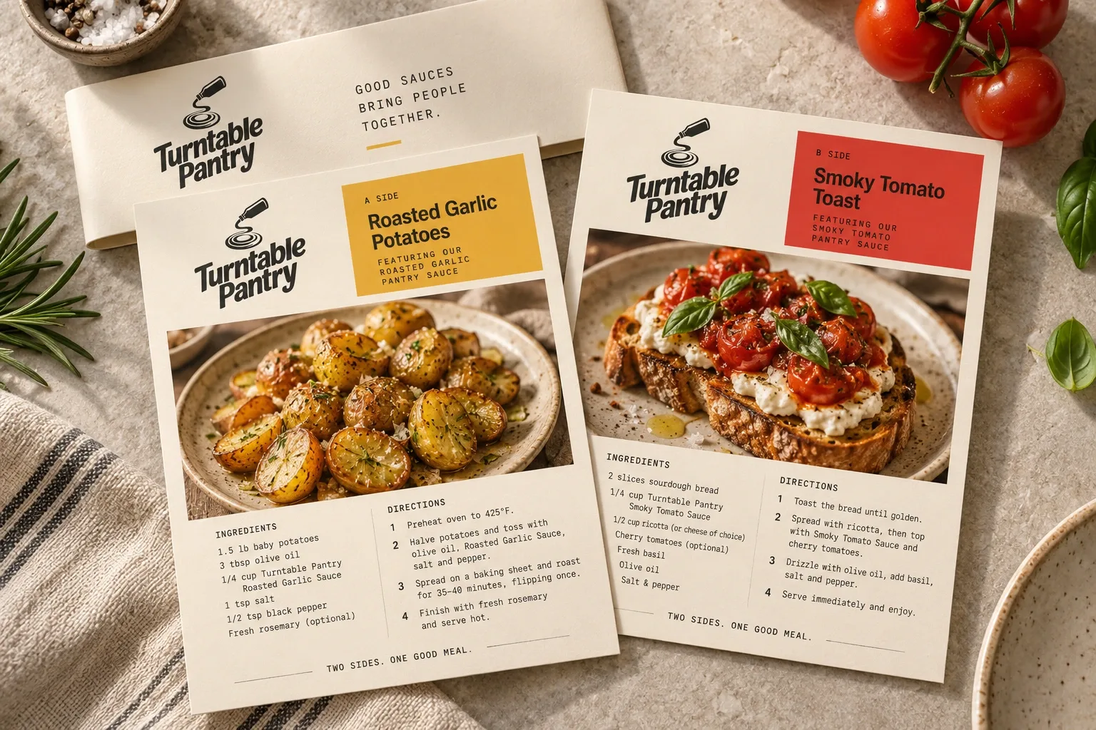
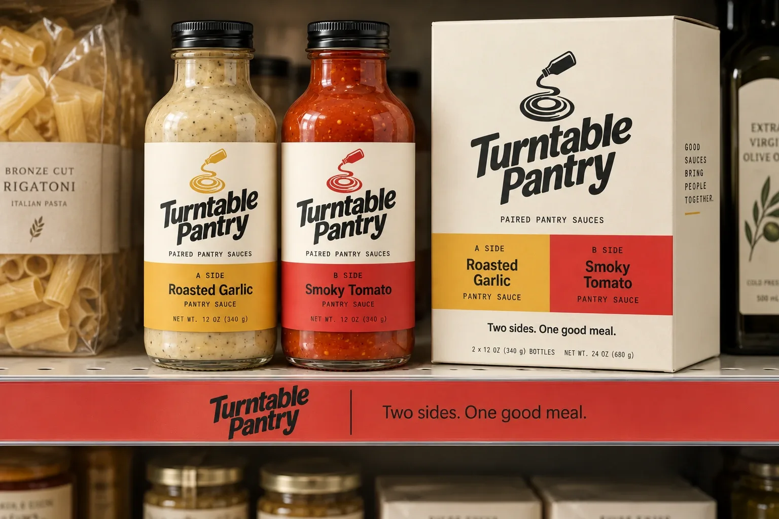
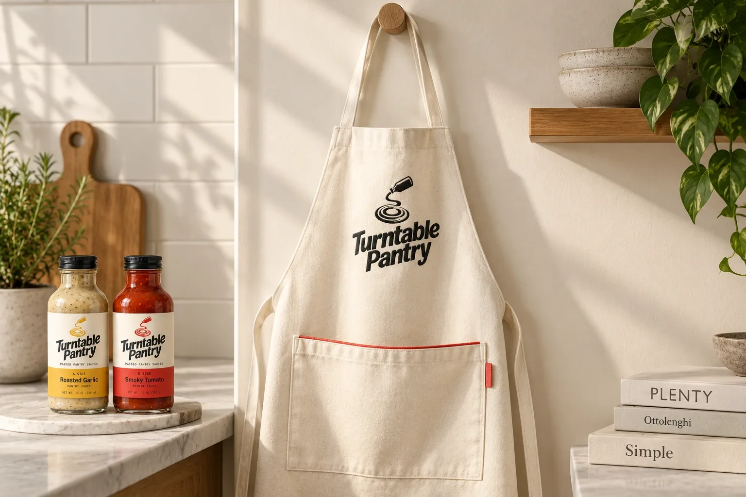
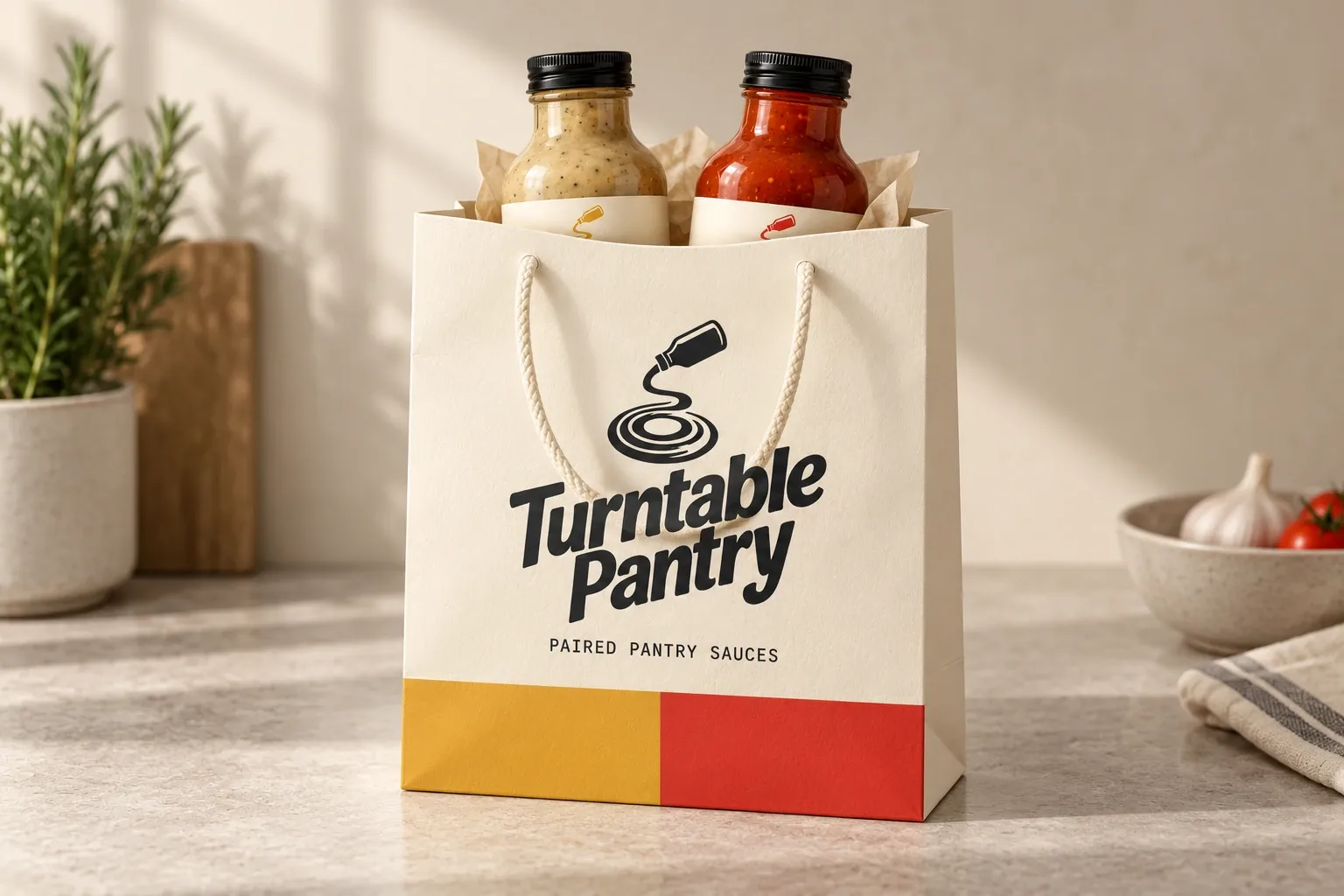
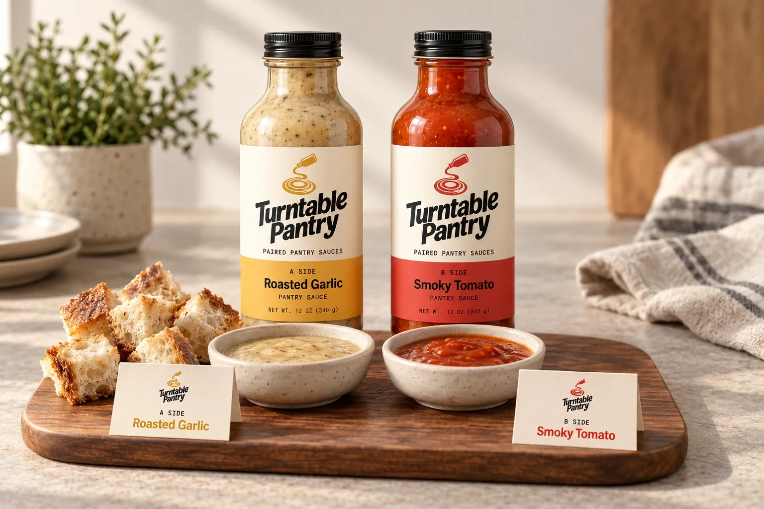
I used the A-side and B-side idea on bottle labels, paired cartons, and recipe pieces. The flavor names stay easy to find.
Application mockups · Select an image to take a closer look.